DailyRuns Brand Redesign (Exploration)

Recently, I found myself in a sticky situation when my electricity token expired on a Saturday night - talk about bad timing! Fortunately, a friend of mine came to the rescue by recommending the DailyRuns app. This app proved to be a lifesaver as it helped me to conveniently pay my electricity bills online. It has consistently been the quickest option available. Their service is lightning-fast!
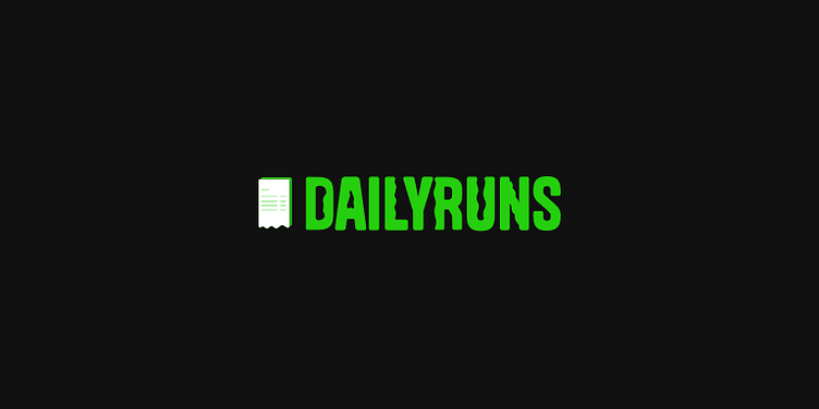
Motivated by my curiosity, I decided to redesign the brand's logo and application. As I study the brand logo, it did not feel like it was describing the functions of the brand, I searched for the brand guide to get more understanding but could not find it on the internet, since I couldn't find the brand guide online, I proceeded to create a logo based on my interpretation of the app's purpose.
Given that DailyRuns is a finance app designed to facilitate the payment of routine bills such as electricity, TV subscriptions, and data, I inferred that the name 'DailyRuns' implies the frequent bills that we pay.
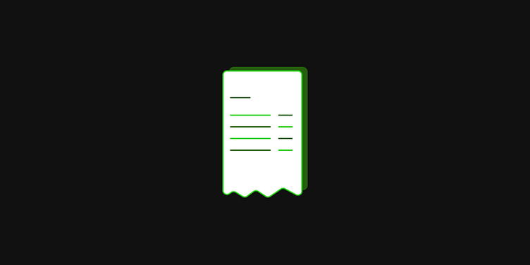
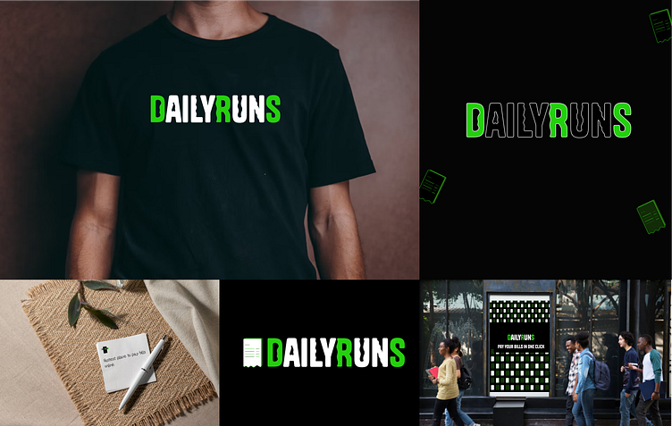
I designed a logo symbol that incorporated a bill icon to visually convey the payment. To make it distinctive, I overlapped two bills and adjusted their placement. For the logotype, I opted for a rounded sans-serif typeface and added waves to evoke a sense of calmness and smoothness, much like a gentle wave. At the end of the creative process, I developed a unique representation of DailyRuns.
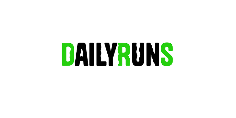
Comparing the current logo and the redesign, which one conveys the function of the app better?