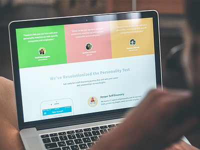
Landing Page Case Study
Hi guys! My name is Marina and I'm delighted to get the chance of joining Dribbble community. Being a keen follower of Dribbble for a long time, I am now happy to get involved in the field as a content manager and copywriter for Tubik Studio.
The designers of our team work on various projects and they are always ready to share their experience and findings. That is why we decided to create a set of case studies in our Blog in order to reveal the secrets and peculiarities of design process more in detail. Today I would like to present you the one about design of a landing page by our designer Ludmila Shevchenko. In the case study we try to analyze the essence and functionality of an efficient landing page as well as describe the practical experience by example of one particular project. So, welcome to read!
The presented case shows that design process is always full of not only art but also research, analysis, testing and tight collaboration with a customer. Designers working for the studio are aware of all those things in practice. All of us are keen to do our best so that both our customers and the users of a final product would feel happy. That can be accomplished with creativity, experience, hard work and artistic flexibility and our team is always ready to provide all those features.

