Freonkr®
The primary goal was to create a brand identity that resonated with Freonkr's target audience while embodying the brand's core values of productivity and fun. The new design aimed to inspire users, instill a sense of trust, and differentiate Freonkr from its competitors.
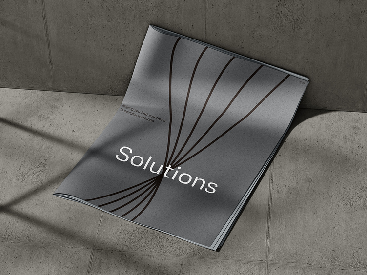
Combined, the brown and greyish color palette creates a harmonious balance between reliability and modernity. It communicates that Freonkr understands the importance of traditional values while embracing the advancements of the digital age. This color scheme also contributes to a visually appealing and cohesive brand identity, making Freonkr instantly recognizable and memorable in the market.
Freonkr's brand identity extends beyond the color palette to encompass a clean and minimalist design approach. The sleek and simple visual elements highlight the brand's focus on efficiency and streamlining workflows. The use of bold typography and modern graphics further reinforces Freonkr's commitment to innovation and progress.
View complete project
—
We're available for new projects, send us a message:
or visit our portfolio
