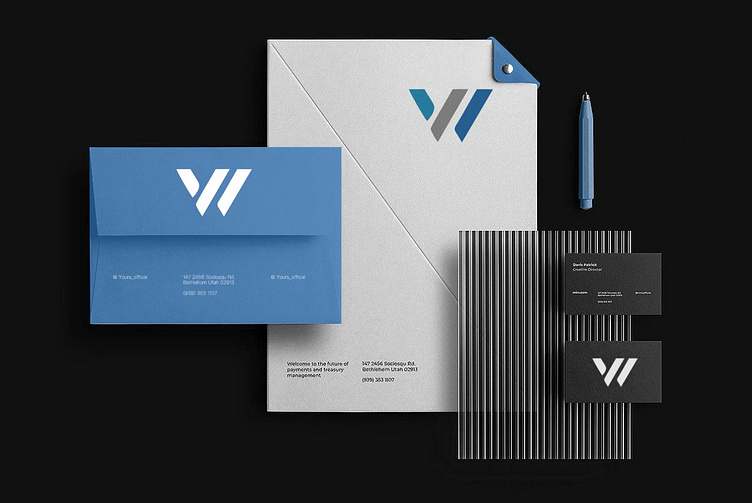
Wardle Consultancy Logo
Wardle Consultancy Logo Design Rendition
The "W" initials logo, designed in a sans serif typeface, forms a cohesive and unified monogram. The brand's name showcases a distinct "W" that consists of three geometric shapes, cleverly utilizing negative space to create a recognizable letter. The logo's crisp edges convey a tech-focused brand, while the typography's capitalization, line weight, and spacing evoke a forward-looking character. The highly readable typeface is intentionally crafted to be concise, direct, and precise, emphasizing the brand's emphasis on simplicity and clarity.
Like it? 💗 it.
We greatly appreciate your support and would love to hear your thoughts on this project.
Interested in partnering with us on your next project?
Send us a message, and let’s discuss how we can assist you. Drop us an email at projects@xclamatory.com if you would like to talk about creating a brand or a digital product.
More about us on xclamatory.com

