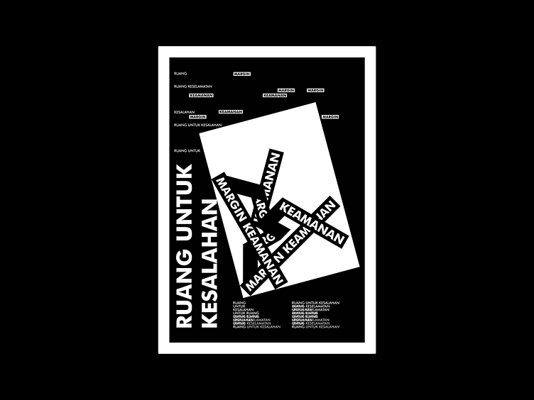
B&W Typography Anti-Design Poster Design Exploration [030723-BA]
[030723-BA]
— In this design exploration, I tried to make something that looked messy, as if it was anti-design. However, actually, I use grids of a certain size to help me make the layout of the poster design. Feel free to leave comments and feedback. And if you find my work useful and you like it, please don't forget to leave love and save it. Also get other latest design updates by following the Sepulang Kantor Project.
[Stay connected with us]
— Instagram: @sepulangkantorproject
— Email: hello.sepulangkantor@gmail.com
More by Sepulang Kantor Project View profile
Like
