Plan.it logo & brand identity design
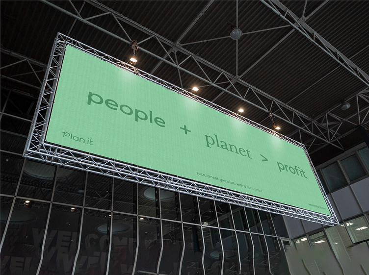
With a focus on people and planet just as much as profit, Plan.it’s goal to positively change the landscape of I.T. recruitment is no short of ambitious. They needed an identity to support them on this journey that felt honest, caring and switched-on (smart).
After conducting competitor research and mind mapping, I noticed that a lot of Plan.it’s competitors use bold typefaces and neon colour palettes in their identities to root themselves in the I.T. recruitment industry.
When diving into my initial ideas stage, I had this in the back of my mind as I wanted Plan.it’s identity to be easily distinguished amongst the sea of sameness. I began sketching out many different P letter executions in the hope to find something original and nodded to their industry. Once I refined a few ideas, I was immediately drawn to the logotype featuring an arrow as part of the P. This symbol represents so much within their industry: hiring, workforce increasing, progress, forward thinking, growth and positivity.

Now that I had the idea, I needed to refine and polish the rest of the logotype. Rooted in modernity and youth with a flare of personality, the typeface I chose to base the logotype on is Fieldwork. Various customisations and tweaks have been made to make the logo fully ownable and ensure optical balance. The most notable is the letter T, making it wider to offset the width of the P.
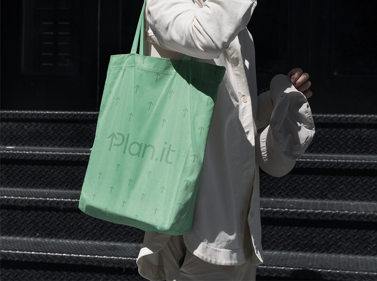
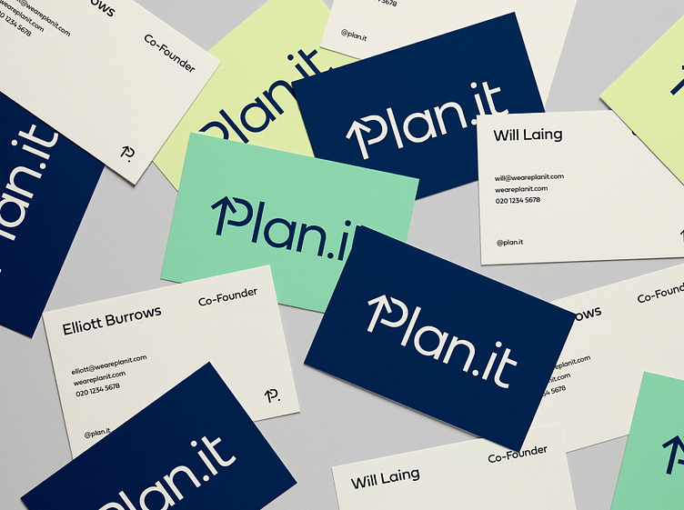
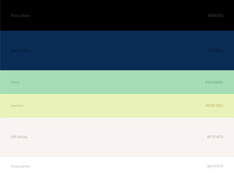
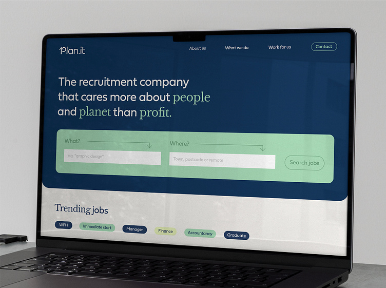
Once I finalised the logo, I set to work curating the perfect colour palette. Using greens and browns to position Plan.it in the eco space wasn’t an option as the environmental arm of the business isn’t their only focus. Saying that though, the palette needed to feel refreshing and natural so the identity could flex between eco-friendly, recruitment and people applications.
Ready to create or refresh your brand's identity?
