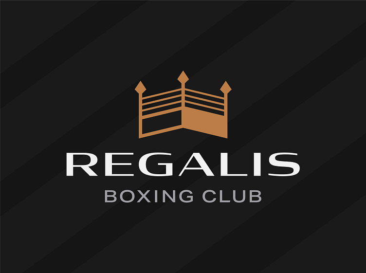
Regalis Boxing Club logo design
Situated in the heart of Liverpool, England, Regalis Boxing Club provides boxing sessions and one-to-one coaching for the whole community ranging from competitive boxing classes, beginner academy classes, infants classes for boys and girls years 5-8 and recreational fitness classes.
With the brand name rooted in prestige and royalty, I wanted to incorporate that same feel into the identity without being too cliché. After toying with the execution, I found a way of combining a crown with a boxing ring to create a simple yet unique and identifiable brand mark for Regalis.
I needed to be mindful of the width of the logomark when selecting and customising the supporting typography. I chose, what I call, a subtle-serif typeface which brought with it the nod to high-end services we needed but with a modern touch.
Further cementing the identity at the premium end of the boxing club market, I chose a golden copper primary colour paired with off whites, various greys and black. This would work well when identifying the club from a distance on fighters’ kits. Stoked with the outcome!


