Vivoo UTI Mobile App Case Study - UX/UI Design
How did we meet Vivoo?
When we joined Vivoo, a wellness application, we were expected to redesign the home page of the existing application in the first place. During our 10-day preliminary work, we examined and analyzed the competitor companies in the wellness sector and the applications that include the features that we see as open to improvement, such as medical, health, fitness, diet, meditation and daily habit tracker. We noted the approaches and component structures we liked to use in our project.After presenting our homepage project in the case study format to the entire Vivoo team, we joined the team, and our one-week onboarding process began. During this time, we attended presentations by the design and brand team leaders, which explained who Vivoo was, its vision and mission. We learned about our team members, their tasks, work plans, and tools. The most challenging part for us was examining the system that the previous design team had established and then working to create a design system in Figma.
How did we manage the UTI project?
• After the Wellness App project, we continued with the UTI App work. Throughout the project, we participated in the “App Daily” meetings, which occurred every Monday, Wednesday, and Friday, and involved the entire Vivoo team. During these meetings, we shared what we had done the previous day and what we would do that day.
• Every two weeks, we held "Iteration Planning App" meetings to discuss in detail whether we had completed the targeted tasks during the previous sprint, whether anything had blocked us, and what we needed to improve.
• After each quarter, we had our “Retro App” meetings. Here, we shared our ideas with the entire team in real-time on an Excel file on what we were doing better and what we could improve compared to the previous quarter.
We took care to work in alignment with the Android and IOS teams during application development. Before starting the developments, we gathered with the software team and conveyed the points to be considered. After each test version, we identified UI fixes and shared the documentation prepared for the next sprint with the QA Developer, in order to proceed with the tasks smoothly.
Brief
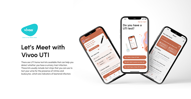
With this product, users can conveniently detect the presence of urinary tract infections by urinating on a specialized test strip and scanning the results through a dedicated mobile application. This provides an efficient and user-friendly method for individuals to monitor their urinary tract health and take proactive steps to prevent theoccurrence of UTIs.
Goals
• Enable users to perform follow-up tests for urinary tract infections within 90 seconds, in the comfort of their own homes.
• In the event of a positive test result, facilitate prompt and convenient access to medical care by arranging a consultation with a doctor.
• Provide tips and articles, to help the users optimize their urinary tract health and prevent the occurrence of future infections.
Problems Statement
Urinary tract infections (UTIs) are a prevalent bacterial infection, affecting approximately 150 million individuals worldwide each year.
• Pregnant women are particularly susceptible to UTIs during weeks 6-24 of pregnancy, due to changes in the urinary tract. As a result, they require a reliable and trustworthy test to detect UTIs and prevent potential complications.
• Research shows that 40% of women who experience UTI symptoms self-diagnose and do not seek medical attention, which can lead to inadequate treatment and complications.
• UTIs are the most common indication for antibiotic prescriptions among older adults, yet studies suggest that the majority of antibiotic use in this population is inappropriate and unconscious. As such, there is a need for effective and accurate UTI detection methods to prevent overuse of antibiotics and reduce the risk of antibiotic resistance.
Design Process
Benchmark
Benchmarking studies have proven to be a valuable tool in assessing and improving business performance, enabling organizations to identify strengths and weaknesses and better understand their position in the market relative to competitors. By leveraging benchmarking data, we can refine their strategies, optimize processes, and drive more tremendous success and profitability.
User flow
User flow is an essential part of designing a user-friendly and intuitive product. User flow is the process of identifying the steps a user takes to accomplish aspecific task or goal within a product. By mapping out the user flow, designers can understand the user's journey and identify pain points, confusion, and opportunities for improvement.
Information Architecture
Information architecture (IA) is the process of organizing and structuring information in a way that makes it easy to find and understand. IA involves creating a hierarchy of information, defining categories and labels, and designing navigation systems.
Wireframe
Wireframes are a crucial tool for UX design, providing a visual blueprintof the layout, structure, and functionality of a product. They help to clarify design requirements, facilitate collaboration, and enable designers to test and refine design concepts early in the design process.
Design System
Design systems are a set of guidelines and standards that establish consistency and coherence in the design of digital products. They include a range of elements such as colour palettes, typography, iconography, UI components,and design principles.
Final Design
Final design is an essential step in the design process that ensures adigital product is visually appealing, functional, easy to use, and accessible to all users. It is a crucial stage in creating a successful digital product that meets the needs of its users and supports the goals of the organization.
Key Takeaways & Lessons
By building this Vivoo UTI project, we were able to apply and test the design thinking process in a real-world setting. Here are some key takeaways from this project:


