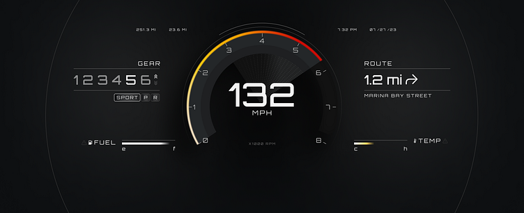
Vehicle HMI Explorations v1
Digital HMI explorations v1
Font: Orbitron (Google fonts)
Icons: SF 5 (concept only)
Made with: Figma
US market display (gears, mph, time notation, etc).
Loosely based on one of the Perception concepts for the Ford GT (2017), but put the speedometer and speed front and center.
Still wondering about a couple of things:
0-8 RPM, should always be 10 i think?
Time display: Should probably be bigger, but IRL perhaps better on the central console instead of here, behind the steering wheel.
Modes: sport, reverse and park mess up the symmetry a bit - maybe place center, under the speedometer?
Route: Depends on the in-car system telemetry what could be displayed here vs the middle console, but would personally love a direct overview of upcoming turns, functionality easier on middle panel, but here you don't have to turn your head.
Should be UX researched. As always. 😉
More work and UI experiments:

