Date Picker Component — Dark Theme
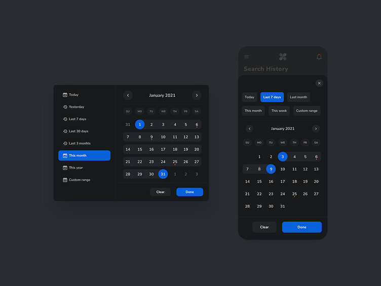
Dive into a date picker component showcased in a sophisticated dark mode. Tailored for effortless selection, users can easily pick a custom date range, or opt for a range from a pre-determined set. Engineered to be responsive and lightweight, this UI component seamlessly marries functionality with aesthetics, making each interaction not just intuitive, but also visually delightful.
Cheers!