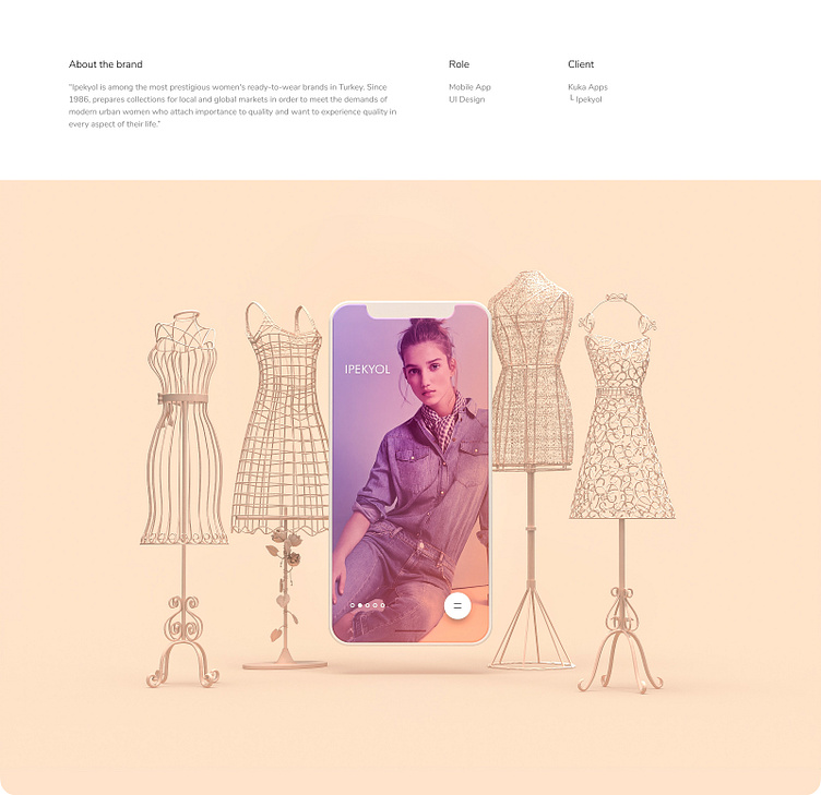
Ipekyol E-commerce Mobile App UI Design
Welcome to İpekyol mobile e-commerce UI design (2017). Our approach to this project was to provide users with a smooth and enjoyable shopping experience without making exaggerated claims.
One of the standout features of our design is the introduction of a unique solution for the main menu—a "single-button usage" approach. We understand that this may sound unconventional and perhaps even risky. However, before implementing this navigation system, we conducted a series of small-scale user feedback sessions specifically targeted at regular clothing consumers. These insights proved to be invaluable in shaping our design choices.
Throughout the project, our primary focus was on creating an engaging and efficient shopping experience (needless to say). We considered factors such as ease of navigation, intuitive interactions, and visually appealing elements to ensure a seamless user journey. Our aim was to strike a balance between aesthetics and functionality, offering a delightful experience that resonates with the brand's values and target audience.
We firmly believe that our diligent research and user-centric design approach have resulted in an interface that not only sets itself apart, but also caters to the needs and preferences of Ipekyol's discerning audience. Embracing innovation without compromising usability, our mobile e-commerce UI design for Ipekyol offers a fresh and engaging experience for every user.


