Webville Logo
First concept for a new client. A pair of web developers are starting their own company and asked me to play around with a logo for them.
The brief was a bit loose, so had to find something to focus in on. I looked at tag lines for them first, as I felt that if I could find something short and sweet, that might help create a direction for the logomark.
A few things that they mentioned about their proposed company 'making things word', 'putting code together', 'creating and building web platforms', details and flexibility'. Looking at these I sort of arrived at both a tag line and a rough idea.
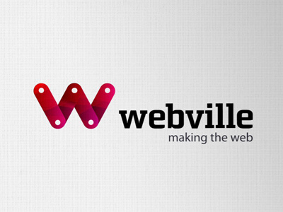
'Making the web' is one idea for a tag line, and then this lead me to literally making the 'w' out of 'parts'. Much like meccano I guess, 4 modules linked together on a pivet. Each can move, be repositioned or fixed into place.
THe font is a solid choice to reinforce their keenness to be seen as reliable and serious coders, to not fall too much into the webby or web2 style of logo.
The one extravagance is the coloured fill that really brings out the logo. Even without the fancy coloured fill, it works just as well solid black on white or vice versa, so no reproduction issues.
The "W" also can be animated if desired, the arms of 'w' can be moved, swung, expanded and rotated until it falls into position, much like the arms of a rag doll I guess :)
So ultimately looking past just a static identity.
