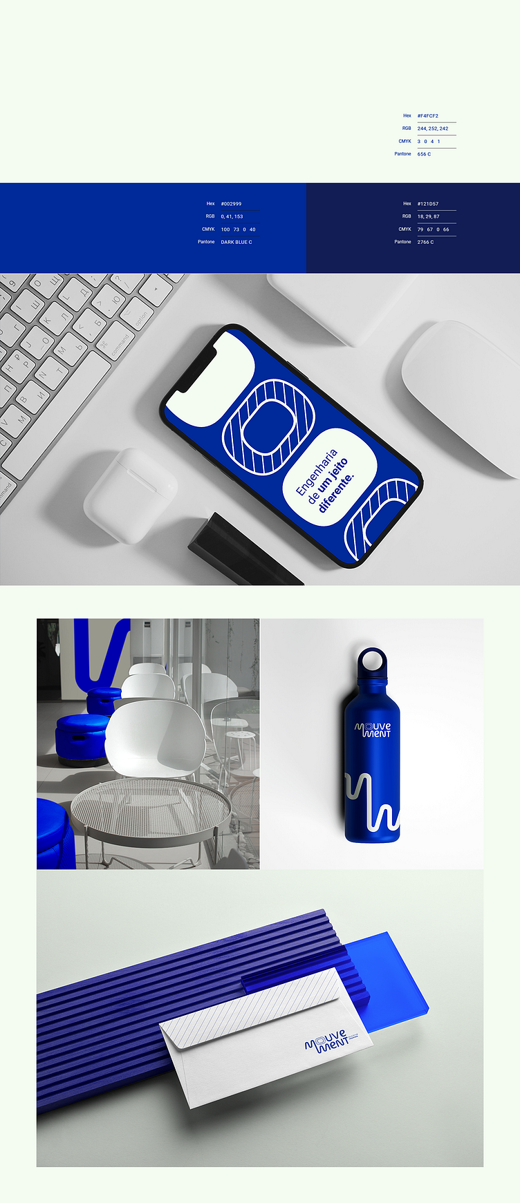
Engineering Mouvement

The concept reflects in the formation of the name a dynamic trajectory of reading in the encounter of the two letters “m”. Following the intelligent simplification of the universe of mechanical engineering, it carries the representation of the view of a cut in the vowel “O”.
To distance the too “square” perception, the font balances rounded ends and adds to the vowel “e” a humanist charge that allows for more comfort in reading.
This is one of my works and it is complete on my Behance:
https://www.behance.net/gallery/168779515/Branding-MOUVEMENT-Solucoes-em-Engenharia