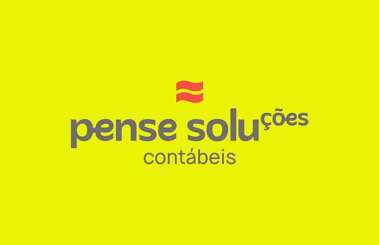
Accounting Logo
The logo consists of a brand composed of text plus a symbol that conveys the idea of potentiation, a mathematical operation that represents the successive multiplication of a number by itself.
In this concept, the design was created with the "tions" high, in order to demonstrate that all actions, guidelines, solutions, will multiply the results of the companies that become partners.
The equal sign is similar in its shape to a wave, as it complements the meaning of the result, carrying the association of lightness, fluidity, flexibility, which the brand's positioning has in its culture
See more on my Behance and Instagram — nathipacheco https://www.behance.net/gallery/150370427/Branding-Pense-Solucoes-Contabeis
More by Nathi Pacheco View profile
Like

