Redesign Goodreads app
Hello everyone,
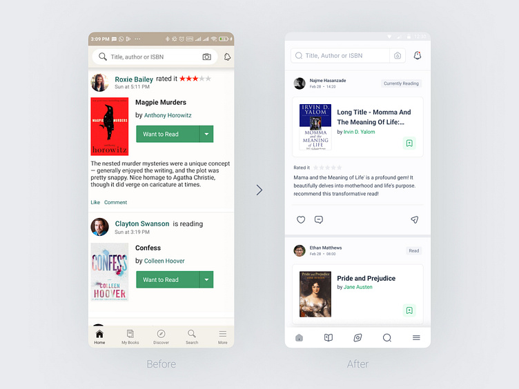
I wanted to share some exciting updates I made to one of the pages of the Goodreads app as a UI/UX designer. In addition to enhancing the user interface and implementing small UX improvements, I have also revamped the color palette to create a more visually appealing experience.
One of the notable changes I made was adding a feature similar to Instagram stories in Goodreads. This allows users to share snippets of the books they are currently reading with others. I also introduced a card layout for each book, providing a more engaging and intuitive browsing experience. Users can now save books in a bottom sheet and easily categorize and label them.
This is just the beginning, as I plan to redesign the rest of the pages in the future and share my progress with you. I hope you appreciate the new color palette and enjoy the changes I've made so far. I would love to hear your feedback and comments.
Thank you!
