Village of Donalda - Bold & Bright
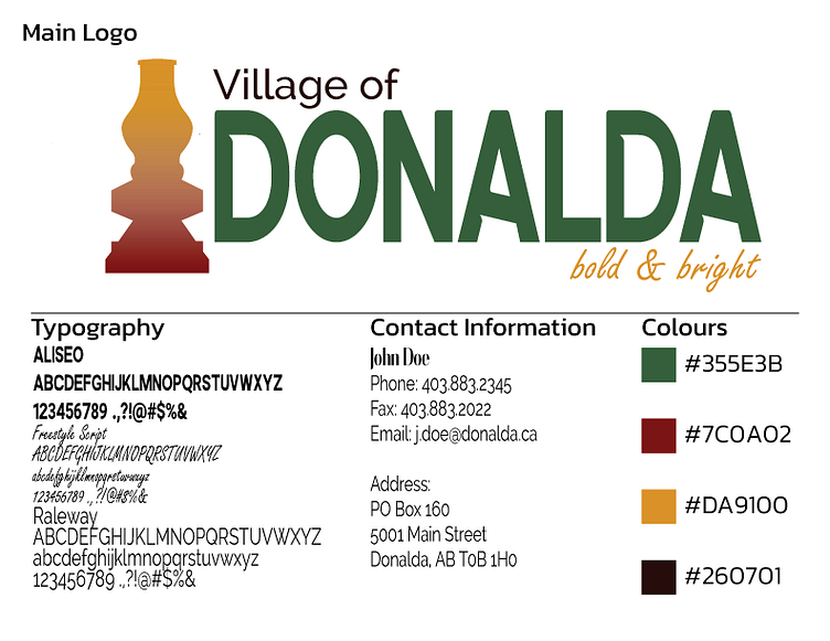
When recreating the Village of Donalda logo, I knew I wanted to make a more modern change while still keeping the essence of the original logo. I also wanted to step out of my comfort zone and try a logo that wasn't an emblem (which is where I excel at). The original logo is a large emblem as well. So I went with a combination mark logo. The original colour scheme gave me an 'old' feeling so I kept a similar palette with green, burgundy, and brown. I added the pop of yellow, exchanging the cream with a bright yellow. The yellow is closer to what the lamp looks like in person, especially when it is lit up. The basic shape of the lantern was kept, matching the larger-than-life statue, located in the middle of the village. I also changed the main typography from a serif font to a sans serif (ALISEO), giving it a more modern feel. The change of the tagline from "You will love it here!" to "bold & bright." is to show a shift from, honestly, a boring generic tagline, to something related to the light the lantern gives. The use of the bold word also hints at Donalda having a daring or risk-taking environment, relating to the terrain used for hiking/horseback riding trails. I enjoy this re-designed logo because it is diverse and each part can stand alone and still be distinct.
Collateral
How to use all fonts and the Email Signature
Website
Business Card
Newsletter
Apparel
Promotional Products
Presentation


