Scaling Design System : A Dribbble Course Case Study 🚀

Hey, Dribbblers 👋 excited to share my first ever Dribbble Shot.
All thanks to Dribbble's Design System Course by Dan Mall. It was an amazing journey to learn so many new things. Also, thanks to my amazing mentor Michel for all the amazing advice and insights!
So, what's the background story?
I'm a fictional Head of Digital for a space agency called the IPTS : Interplanetary Travel Syndicate. This company helps people travel between different planets in our galaxy. They have three websites:
IPTS Org : A news web portal with latest news and information
IPTS Travel : Travel booking web to visit different planets within our galaxy
IPTS Rail : A real-time updated web app where you can view lines, routes, and times for all the different commuter lines.
My Roles & Goals
1. Creating Brand Style Guide :
I had the task of developing the visual identity for the recently established IPTS company in this project. This encompassed selecting a color palette, choosing typography, and designing various visual components that would be utilized across all three websites and the design system.
2. Creating Websites :
My responsibility also included the design of three websites, which entailed crafting high-fidelity mockups, and additional design resources employed
in the website development process.
3. Creating a Design System :
After establishing the designs for all 3 websites, I need to create
a design system which has at least 5 common components.
4. Chronicle & Document the Design System :
I also need to generate documentation for the design system, encompassing guidelines and regulations for utilising the design system. This documentation would cover various aspects such as visual elements, typography, components, tutorials, and introductory material.
5. Creating a Dribbble Case Study
And lastly, it was my task develop a case study for this where I need to cover all the process i.e from research, design, document, rebranding and transition.
Process & Research
To establish a graphic theme for the products, I initiated a search for inspiration by conducting a comprehensive analysis of websites associated with space travel. The prominent ones included Space X, NASA and Virgin Galactic.
Additionally, I explored various space-themed images on Adobe Stock. Along the way, I captured screenshots of some travel websites like Expedia, Booking, MTA, and London Underground websites.
After a week, this is what I come up with
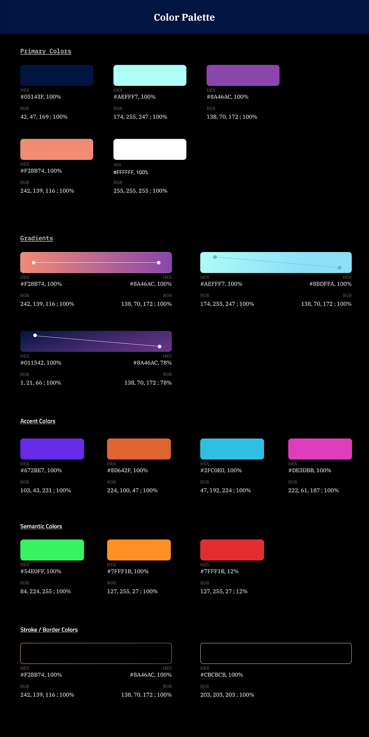
Color Palette & Typography

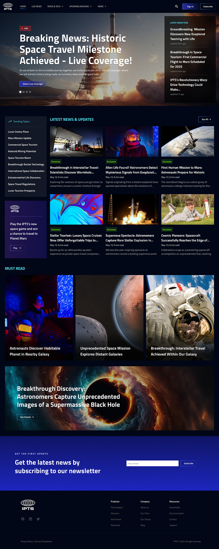
Here's the IPTS Final Mockups
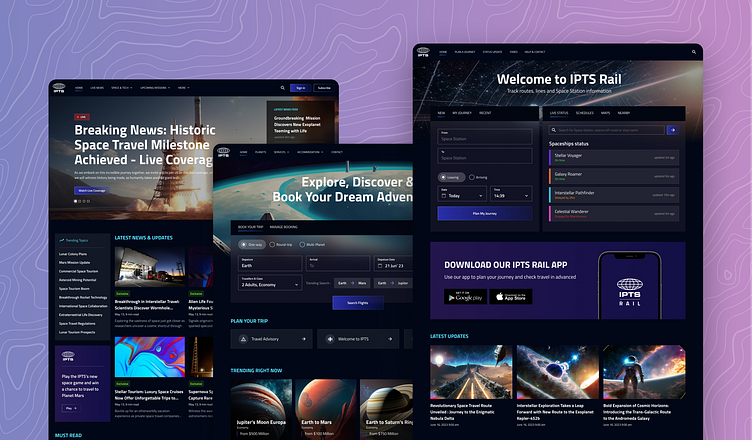
IPTS Org
IPTS Travel
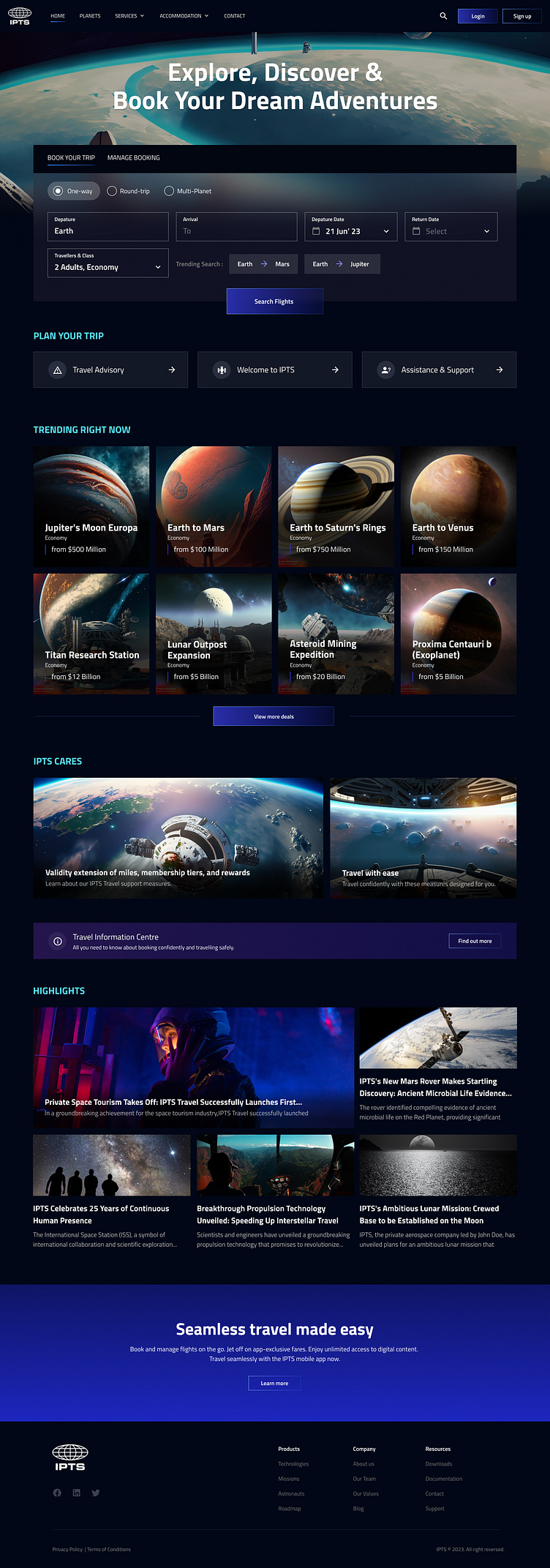
IPTS Rail

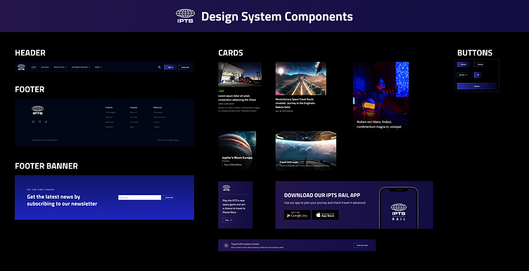
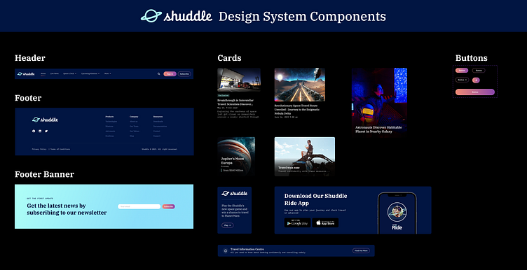
Extracting components from these 3 websites
Here, I needed to extract at least 5 common components from these 3 websites and then add them to a design system library. This is what I get
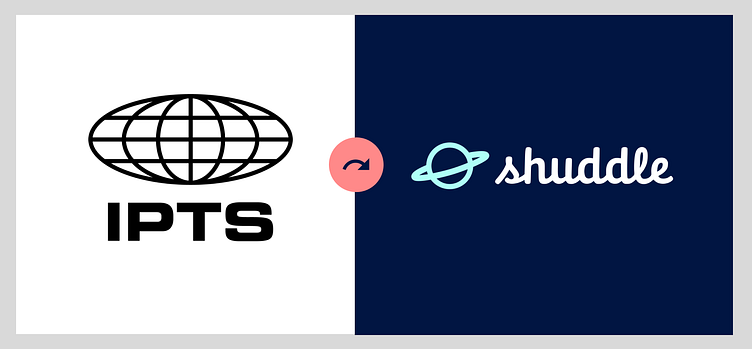
A New Twist : Rebranding IPTS to Shuddle
Maybe rebranding isn't so bad afterall when you have a design system in play.
Introduction to Shuddle
My leadership at the IPTS—the Interplanetary Travel Syndicate — just hired the prestigious branding firm MegaBrand to do a rebrand of the entire organization, and there are a few things that’ll affect the three products you’ve been working on.
MegaBrand discovered through focus groups that the IPTS name and logo felt very ominous, like it was cold, faceless corporation that was always watching. (“The eyeball-shaped logo doesn’t help,” said one candid participant.) In addition, the IPTS wants to appeal to a younger demographic.
After weeks of research and exploration, they’ve settled on the new name “Shuddle,” which feels more like a cool, new startup.
The Cool New Shuddle
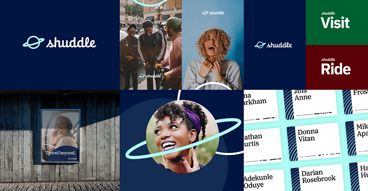

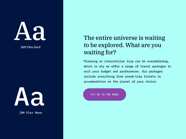
The color palette is fresh and vibrant, and the identity relies much more heavily on photography of younger people to feel more welcoming and inviting.
The typographic palette relies heavily on the IBM Plex superfamily to both give a wide range as well as make everything feel familiar.
The Three New Faces of Websites
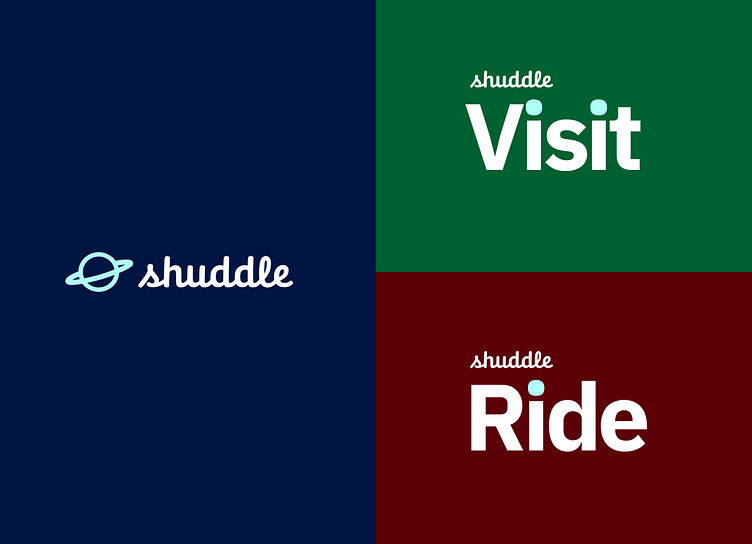
The 3 main products have also been renamed to feel more like a family of products instead of independent offerings:
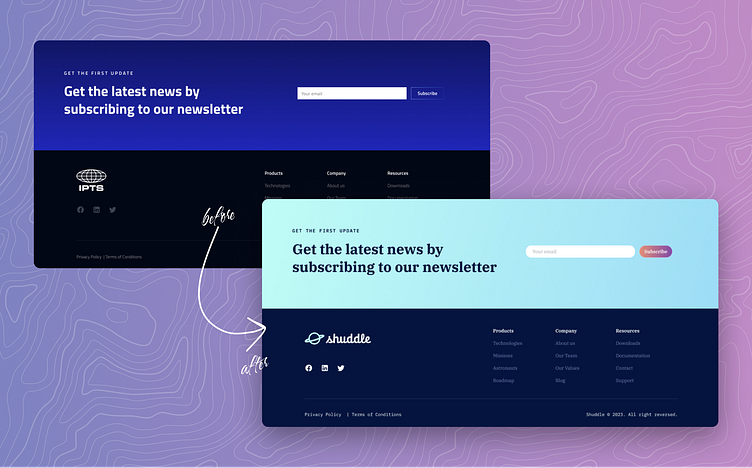
“ipts org” is now “shuddle world“
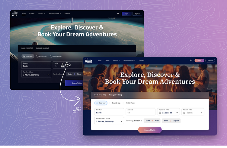
“IPTS Travel” is now “Shuddle Visit”
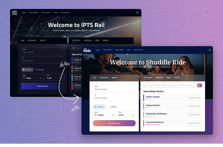
“IPTS Rail“ is now “Shuddle Ride“
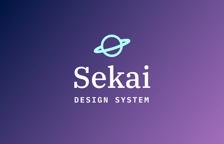
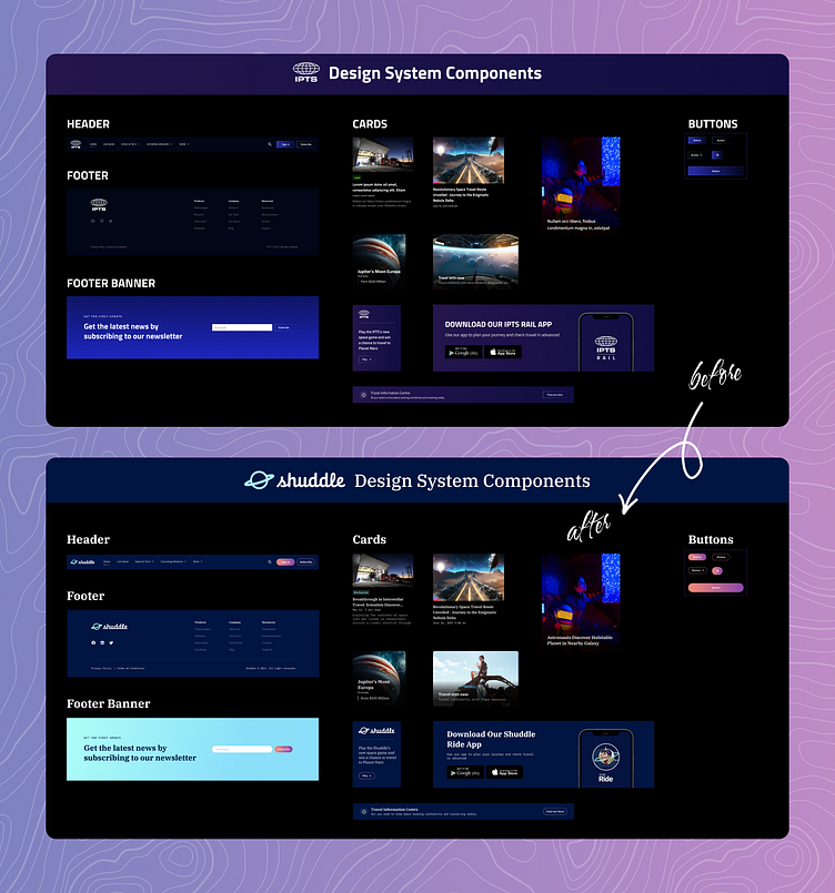
The New Design System is born : 'Sekai'
Here, the existing IPTS design system library has been updated to the newly rebranded Shuddle to match it's fresh color palette and typography. I named this new design system as "Sekai," which means "world" in Japanese.
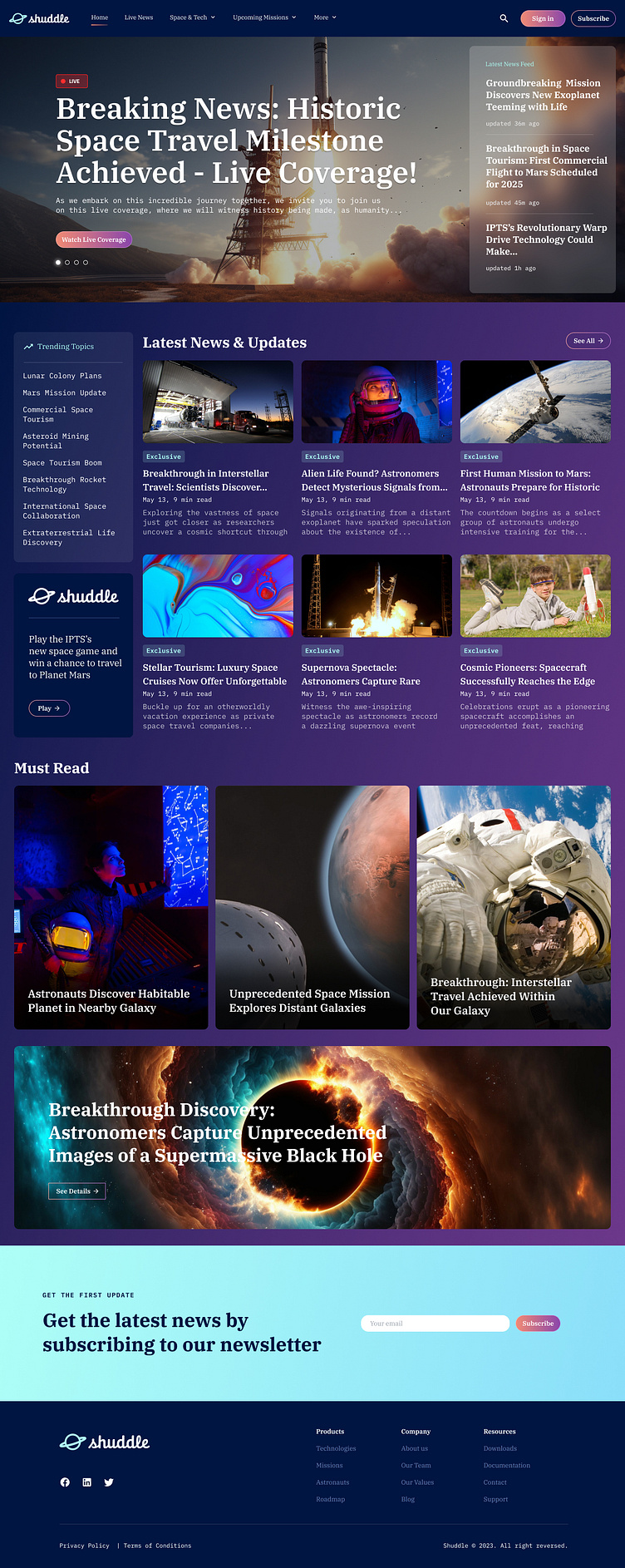
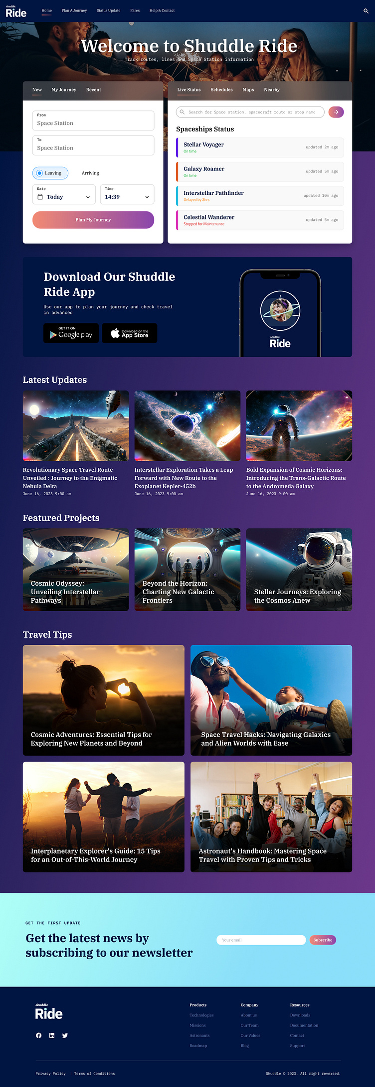
Here's how the newly launched Shuddle websites looks like
Shuddle World
Shuddle Visit

Shuddle Ride
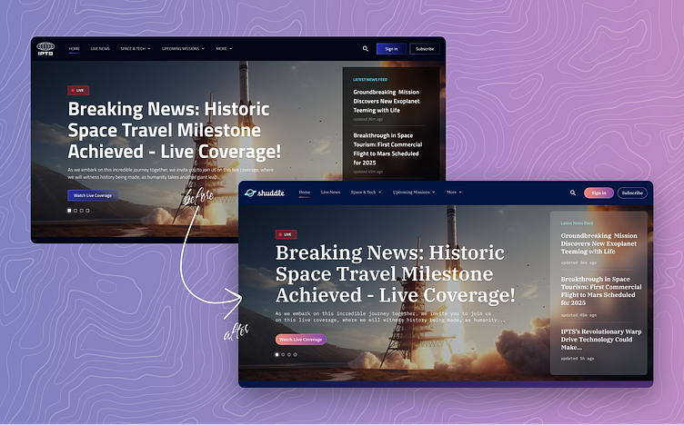
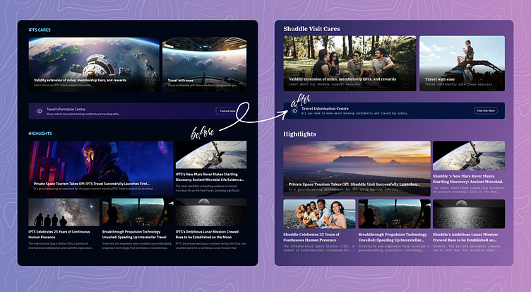
Here's a quick before-and-after comparison
and it's overall impact.
Some valuable lessons learnt!
I've learned a lot during this long journey.
Importance of a Design System :
A design system is incredibly important for an organization as it acts as a shared guide for creating consistent and cohesive designs. It provides a set of reusable components, styles, and guidelines that help designers and developers work efficiently and effectively.
With a design system in place, teams can maintain brand consistency, save time and effort by reusing existing elements, and ensure a seamless user experience across different products and platforms. It promotes collaboration, streamlines the design process, and ultimately enhances the overall quality and usability of the organization's products and services.
Scalability, Hot-Potato Process & 80/20 Rule :
It's important to think about scalability from the beginning. This helps us prepare for future challenges that might come up unexpectedly. By doing so, we can save our customers a lot of trouble, time, and money.
The "hot potato" process greatly speeds up the workflow and processes needed to create these systems.
The 80/20 rule is a great approach, and it's important to document our progress along the way, rather than leaving it for the end. This way, we can keep track of our defined styles, components, and more.
That's all folks! Have a nice day!
Thank you for your valuable time!
