Obsidian Gold
So, while shopping for some new threads, I began to nitpick a few issues I've had with online shopping mobile experiences. So popped open Photoshop to play with the new artboards. This is the quick result.
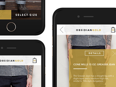
Imagine the new ObsidianGold (fake company, but I really dig the name, so I'm claiming it, lol) product page.
I've created 3 screens to showcase a streamlined experience for product variety selection and detail page, while showing the beauty of the product and an open UI thats easy to use and non cluttering.
Shout out to http://leftfieldnyc.com/ for their gorgeous denim.
Check out the real pixels in the attachments.
More by Justin Greene View profile
Like


