Where Art Meets Earth: Cera's Pottery
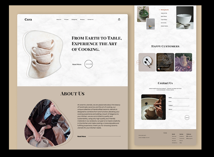
We used a harmonious color palette inspired by earthy tones and natural elements. Muted neutrals like warm browns, soft grays, and subtle greens create a serene and organic atmosphere. These colors evoke a sense of grounding and reflect the natural beauty of ceramics. We also integrated subtle textures or patterns that mimic the feel of clay or other natural materials. These textures add depth and visual interest to the UI design, evoking a tactile experience and reinforcing the brand's connection with the earth and craftsmanship.
