Sisterhood Magazine
Howdy Mates!
Check out my super fresh web design case study!
This time it's for a educational and inspirational magazine called Sisterhood.
Here we talk about style, beauty and all things that make women FABULOUS.
This magazine is designed to keep you on your toes by raising awareness about women's equality and making progress towards this goal.
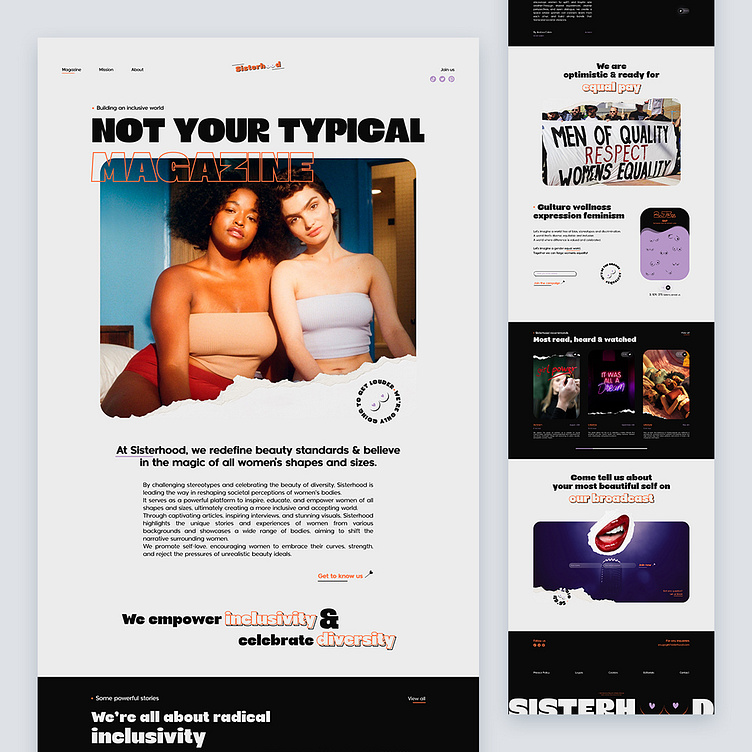
So here's a glance at the landing page's design telling inspiring stories of amazing women of all sizes and shapes.
If you take a closer look at the design you'll realize user experience is focused on text content with a stylish touch with a thought-out choice of fonts and moderate color palette.
Prominent photo content creates the needed atmosphere in split seconds and working well with the text. Minimal and intuitive navigation combine with a solid visual hierarchy that allow for effective scanning and skimming.
Hope you guys will like it!
Any thoughts on this? Eager to read them where they belong!
Still not following me?
Here is the link to make your day better @weare_wildstudio
Thanks a million for your support and feedback.
Stay green, cheers! 🌲
