Bandwagon Brand Design
Design Philosophy for Main Logo
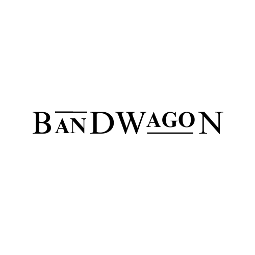
Bandwagon is a luxury culture brand selling trending and reimagined fashion clothing, such as t-shirts and suits. It is unisex, and the feeling I intended for the brand is classic yet chic and smart. Consistent with their methodology, the logo design would also be simple and minimalistic, devoid of too much clutter and unnecessary elements that go against their design philosophy.
Design Philosophy for Favicon
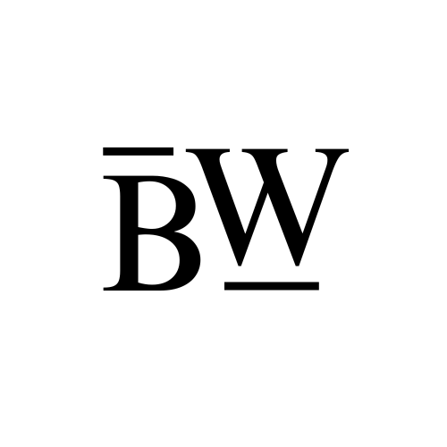
Like all fashion companies, it is important for Bandwagon to have a simpler logo design to act as a favicon and easy to remember branding. The simple BW monogram elicits simplicity and elegance, as well as linking to the lines of the larger main logo.
Fonts
Times New Roman was used to elicit a sense of classic, like a clothing stall in up-street London. This played suitably with the lines positioned at the top of "Band" and at the bottom of "Wagon", which symbolise the beautiful river Thames that inspired so many fashion trends and designs in London.