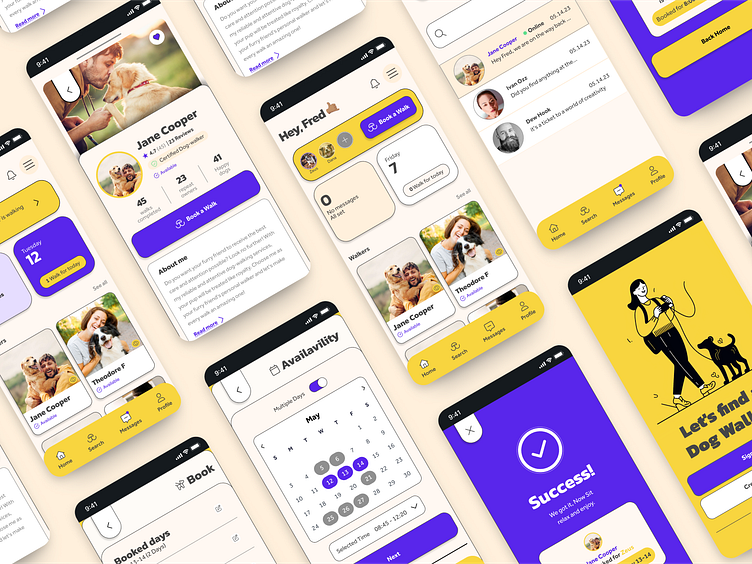
Perry - Dog Walking Book App Case Study
Discover peace of mind with our Perry, connecting dog owners with reliable and trustworthy walkers, all from the convenience of home.
Design Brief
🐕🦺 Problem
Dog owners often face a dilemma when their busy schedules or travel plans make it challenging to provide regular walks for their beloved pets. Finding reliable and trustworthy dog walkers becomes a pressing concern to ensure their furry companions receive the care they deserve.
🥴 The Pain Point
How to do an easy book and trusty process to find dog-walkers in a City where are not used to taking these services.
🎯 The Goal
Create a modern dog walking app that focuses on trust, fosters strong relationships between owners and walkers, and offers a safe and stress-free experience for dogs and their devoted owners.
🙋🏽♂️My Role
This amazing experience let me explore different roles, like conducting interviews, leading a fun Affinity Mapping Workshop, Creating Wireframes with Figjam, Making Prototypes with Figma, and even building The Design System and Final UI. It was truly my first adventure as a Product Designer, and I loved every step of it!
_____
1. Empathise
I had the opportunity to connect with dog owners through interviews, digging into their needs and concerns to truly understand what they were going through.
_____
2. Define
Competitive Analysis
By studying our competitors' apps closely, I compared their main features and services. This valuable research guided us in enhancing our own offering.
User personas are like fictional characters that represent the people we're designing for. They help us understand our users better by capturing their goals, needs, and challenges. With user personas, we can put ourselves in their shoes and make design decisions that truly meet their expectations. It's like having a guide that keeps us focused on creating a great user experience tailored to our target audience.
Creating an initial user flow for onboarding and registration is crucial for a smooth user experience. This, in order to make an easy and fast experience.
_____
3. Ideate
Wireframing
Mood board
To establish a friendly and calming atmosphere for the app, I focused on defining its visual style. To accomplish this, I curated a mood board that incorporated color, UI, and illustration references. Opting for a warm and neutral palette with a high contrast purple to emphasize some CTA and Buttons, utilizing simple and flat illustrations. This approach helped create the desired friendly and soothing vibe within the app's visual aesthetics.
Design System
I enjoy creating Design Systems. It enhances the customer experience by maintaining consistency and accessibility. I make sure the content meets accessibility guidelines throughout the process.
User Interface
_____
4. Prototype
Takeaways
🐕🦺 The Process
Throughout this project, I had the chance to engage in every stage of the Product Design process. This not only enabled me to create a meaningful user experience but also provided a valuable opportunity to explore and master new tools and techniques.
💬 Visual Design and Research
Two of the most interesting parts of the process were User Research and Visual Design. Center the user to improve the experience and find better ways to lay out the information.
If you enjoyed this case study please give it a 🖤.


