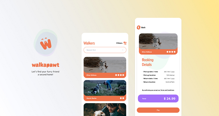
Walkapawt!
Dog owners sometimes need help caring for and walking their dogs.
As part of Dribble product design course, we were tasked to create a service to connect dog owners with dog walkers. Taking into consideration how we can help dog owners trust their dogs are in safe hands.
Know your user!
This service that we had to create, shouldn't be based on assumptions at all, it has to be based on real user needs.
Therefore we had to go out and interview some real dog owners. All questions had to be linked with a goal, and we had to empathize as much as possible to the user needs and wants
Here is an example of one of the interviews I conducted with markups:
Beyond the user, we had to look into services that already existed in the market and see where they are doing well and where they need improvement.
Here's an app that stood out to me during my research:
Building on the findings
Following the research, the insights came in very handy to try to understand the user, a great method we learned is to use that to create a fictitious user persona that we then cater for during the design phase
Time to have a map
Another method to help the user achieve the goals offered by the service is to create a "User flow", which is basically an overview of the steps that the user has to take to get the task done
Whiteboard session
Based on the research, it's time to decide which elements and components do I need to help the user to get the task done, keeping in mind there should be a balance between the amount of input/output that the user has to go through before achieving any result.
We used wireframe to envision how our screens should be structured to achieve the user flow developed earlier
Setting the mood
Before we jump into design, we had to look for great examples from other designers out there. I knew from the begging that I wanted the app to be warm friendly, and a little into the playful side.
Here are the designs that I found very close to my vision:
Taking some hints, I started with a rapid design session aiming to come up with 3 distinctive variations, taking into consideration the basic design principles
How about we get into design now?
Now that the mood is set, I felt ready take my favorite variation from the exploration earlier and apply it across all my wireframes
While I'm at it, I designed a logo for the app, defined the color palette and typography styles.
I also looked into components that can be reused for scalability into more screens in the future.
This is was a chance also to learn about the powerful Auto-layout feature in Figma!
Show time!
Finally I connected all the screens into a prototype and invited some users to test it, took notes, and did few iterations until it worked.
Check out the onboarding happy path:
Learnings
Designing a digital product based on assumptions is not the best thing after all. Trust the process and go out to learn from real user, empathize with there needs and pain points, then use all the superpowers you have to make a beautiful and functional products that your users will love!
Here are some more features that I might add to the app in future:
Booking a trial walk (free meet and great)
Map tracking and live video
Store and other value services
Please let me know if you have any further suggestions or comments


