iWeather - Weather Forecast App

Briefing
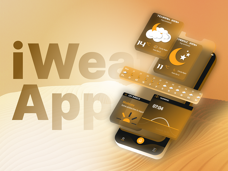
iWeather is here to show you the weather. At first glance, you notice all the necessities and get the information you need. The design is to be appealing and functioning at the same time. Animations aid you in a better experience using this app and having fun.
Wants:
Beautiful & unique design in comparison to the other weather apps
Giving the most information possible with the shortest text possible
Engaging and Attractive to the new users
Challenges:
Designing an icon set for the design from scratch
Animating the design with Figma
User Research and usability test
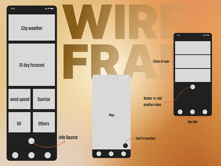
Wireframing
Wireframing the iWeather was the first step. I wanted to know what should be in my design and what materials I needed. After looking at some weather apps, researching the users, and reading the persona, I concluded the parts I wanted to use in iWeather.
Typography
I used two different fonts in this UI design and changed the sizes and thickness based on the need of the page.
Rog fonts - Regular - 19 px
Rog fonts - Regular - 16 px
Ropa Sans - Regular - 24 px
Ropa Sans - Regular - 16 px
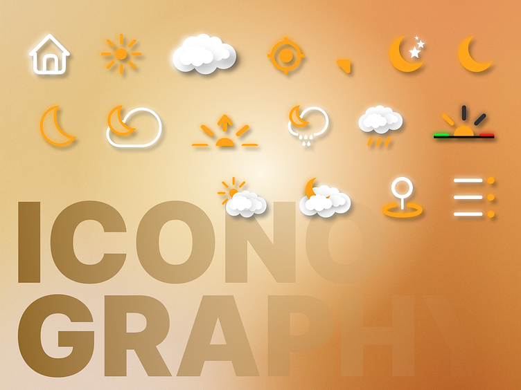
Iconography
I tried to design the icons myself. I got various ideas from different icon packs and combined them. Unfortunately, because of the shortage of time, I couldn’t make an icon set. So I just made what I wanted to use in this particular UI.
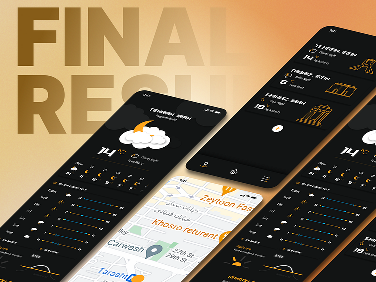
I finally made the design I had in mind. According to my knowledge, I tried to make the typographies, icons, spacing, and other principles as perfect as I could.
Ali M. Kashef
UI/UX Designer By Day, Graphic Designer By Night
For contact: