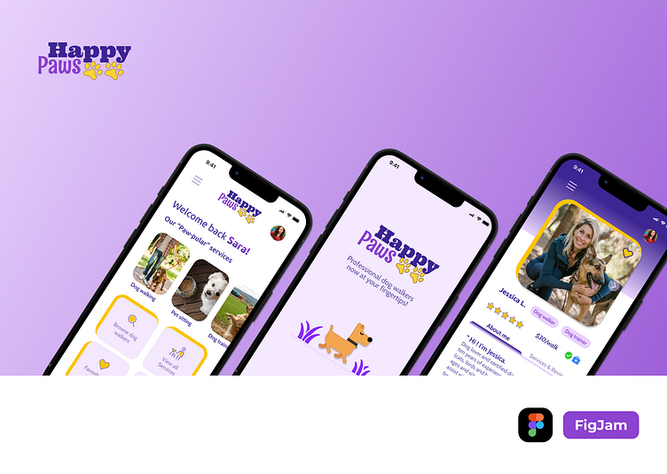
Happy Paws - A Dog-walking App
Project Timeline: March – June 2023
Role: Product Designer
Responsibilities: User Research, UX & UI Design, User Testing, Prototyping
About this Case Study
This case study was conducted as a part of Dribbble’s Product Design certification course. The course curriculum covered UX fundamentals, User Flows, Wireframing, UI Design – Hierarchy, Color & Typography, Scaling designs, Components & Design Systems, Prototyping & User Testing, all of which were implemented to design this product.
Project Brief
Life can get busy and amidst all the chaos, dog owners need reliable dog walkers and pet sitters who can take care of their beloved pets when they themselves are not available to do so. They need an app that allows them to choose from a network of trusted and reliable dog walkers and book an appointment for their pet in a matter of minutes.
Competitive Analysis
I conducted a competitive analysis on two of the leading dog-walking apps in the US market, Rover and Wag. The apps as well as the websites, were taken into consideration while conducting this analysis in order to totally grasp what each product has to offer.
Brainstorming
Through robust and collaborative group brainstorming sessions, our cohort zeroed in on the following pain points, project goals, and solutions to the problems being faced by dog owners using other dog-walking services/apps.
User Interviews
For this phase of the project, I conducted user interviews with five individuals who own dogs and are currently using a dog-walking service or want to use one in the future.
Number of users interviewed: 5
Interview methods used: Zoom (3) & In-person (2)
Average duration of each interview: 15 minutes
Below are some of the findings that were collected as a result of the user interviews -
User Personas
After conducting user interviews, it was determined that the users of dog-walking apps broadly fell into the following categories -
Based on the qualitative research findings collected from user interviews, I created a user persona for a dog-walking app user, Bethany.
Bethany is single, lives alone, and is a dog owner and busy entrepreneur. She uses dog-walking apps regularly for her dog, Emma as she works long hours and travels a lot.
User flows
The user flows created for my dog-walking app includes the following key steps:
· Onboarding new users
· Sign in for returning users
· Searching, contacting, and booking a dog walker
· Viewing dog walkers' profiles, reading and posting reviews.
The goal was to create a user flow that is straightforward compared to other dog-walking apps, making it user-friendly for people of all ages and technical abilities, allowing for a fast and efficient booking process.
Wireframes
Based on the user flows created in the previous phase, I came up with a set of wireframes to outline the basic layout of the app screens.
Visual Design
Mood board
I created this mood board to visually communicate the concept and thought process behind my dog walking app. It provided inspiration to create an app that is not only visually appealing but also effective in making the users feel special and cared for.
Colors & Typography
Purple: Compassion, Empathy, Royalty
Yellow: Happy, Energetic, Friendly
App Screens & Features
Prototyping
After completing the visual design of the app screens, I created a prototype (video below) to test the working of the app design. This prototype will also be presented to users in the user testing phase.
Prototype link (Figma) https://bit.ly/HappyPaws-Prototype
User Testing
To conduct this test, I invited two individuals who were willing to give their honest feedback about my dog-walking app. I closely observed them while they navigated their way through the app and took notes in Notion.
Through user testing, I was able to -
1) Determine whether testers can easily navigate through the app.
2) Complete tasks successfully without any external prompting.
3) Identify problems in the design.
4) Find solutions and iterate on the design.
Key Takeaways
As I worked through this case study, I was able to get a good grasp of the design thinking process. The most important takeaways for me are -
I enjoyed conducting user research and learning more about what users want. Creating wireframes and bringing them to life through visual design was also an enlightening experience as I learned so many new tips and tricks to enhance my design skills. This has been a great start and I'm excited to work on new projects and grow as a product designer.
Thank you!
I hope you enjoyed going through this case study as much as I enjoyed creating it. Please feel free to leave any comments or feedback about my work.


