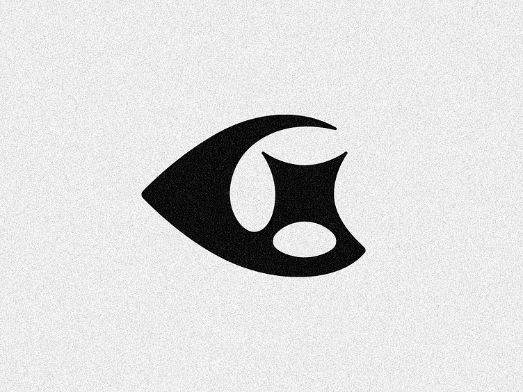
GSix ✦ To the moon! - Final Logo
Finally I can show you this lovely logo at it's final stage! I hope you enjoyed the type treatment, I'm personally very proud of the result.
GSix build thriving Web3 ecosystems by providing incisive data-driven intelligence. The idea here is simple, G/6 + X letters plus star or something "to the moon" related (and in this concept also sort of "eye with a sparkle" idea and the overall shape of a "comet").
The main challenge here is to make something unique and not too similar to my GunThé logo, which was the first client visual reference.
Here you can check the compositions/variations of the type plus symbol in positive and negative versions.
The horizontal one is my favorite composition, but also I liked a lot the sparkle landing aligned up the i "dot"!
It's pretty cool to see again where this symbol came from, both the refinement screencast and the pencil on paper initial sketch, what a journey!
Check all refined concepts here and here (this one is also good!) :)
You can check all the project initial sketches in details here, I hope you enjoy it!
Let me know your thoughts on the comments, I always love to receive feedback on my works!
Also I'm available for new projects, so feel free for ask me!
Need a logo, illustration or other crazy stuff? Email me now :)
Follow & Connect!
Behance • Instagram • Facebook • Twitter • LinkedIn
/bitencourt or /allopoietic over any networks!


