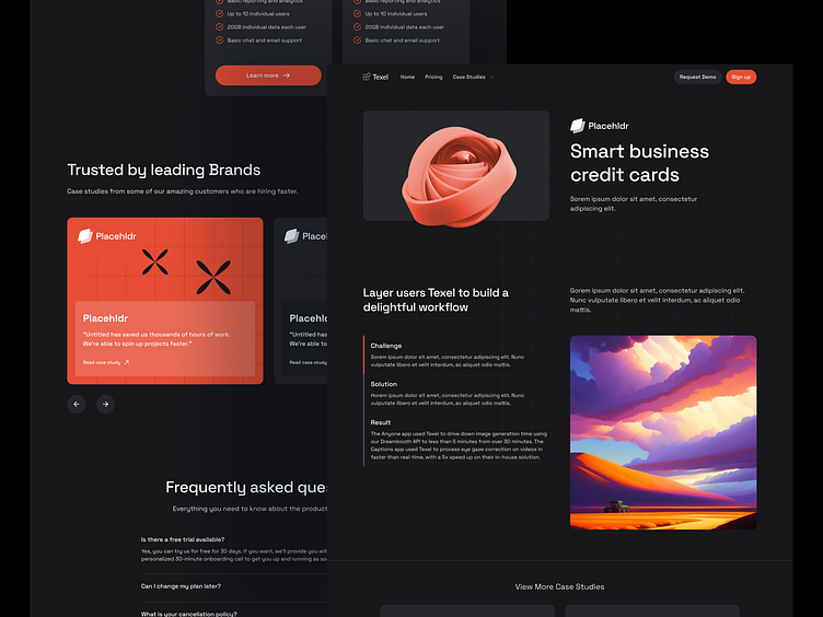
Texel Website Case Study
Overview
The Texel website redesign project aimed to create a comprehensive online presence for the brand, including a landing page, pricing page, how the product works process, and a case study page. The goal was to establish a visually appealing and user-friendly website that effectively showcases the features and benefits of Texel.
User Research
The initial phase of the project involved conducting secondary research by analyzing competitors' websites and gathering pattern references. This helped to gain insights into industry best practices and identify areas for improvement in the existing Texel website.
User Personas
No specific user personas were created for this project. However, during the design process, consideration was given to the target audience, which primarily consisted of tech-savvy professionals and businesses in need of advanced software solutions.
Information Architecture
To structure the information and layout of the Texel website, inspiration was drawn from the analysis of competitor websites. As a result, the website followed established conventions and provided a familiar user experience.
Interaction Design
Due to the limited scope of the project and its focus on creating static pages, no specific interaction design work was carried out. However, basic usability principles were applied to ensure that the website was easy to navigate and understand.
Visual Design
Throughout the design process, regular feedback was sought from the stakeholder. Initially, the project was intended to focus solely on the landing page. However, based on stakeholder input and the need for a functional website, the project scope was expanded to include additional pages such as the how-to process, pricing page, and case study page. This iterative approach ensured that the website addressed the stakeholder's requirements and goals.
Results and Impact
As the redesigned website was launched without any prior online presence, there were no specific results or metrics to measure against. However, the stakeholder expressed satisfaction with the final outcome, as the website effectively showcased Texel's features and benefits. User feedback will be crucial in measuring the impact of the new website in the future.
Iteration & Feedback
Throughout the design process, regular feedback was sought from the stakeholder. Initially, the project was intended to focus solely on the landing page. However, based on stakeholder input and the need for a functional website, the project scope was expanded to include additional pages such as the how-to process, pricing page, and case study page. This iterative approach ensured that the website addressed the stakeholder's requirements and goals.
Key Takeaways
The Texel project provided valuable insights and key takeaways for future UX/UI projects. Streamlining the setup of the design system from the outset can help expedite the design process, even with limited content availability. Additionally, this project highlighted the importance of incorporating user feedback and stakeholder input throughout the design process to align the website with business goals and user needs.


