UX/UI Design Case Study for a Pub

This UX design concept and case study is my second portfolio project for Google UX Design Professional Certificate program on Coursera.
Project Overview
The product:
We are a business that aims to make the pub experience as fun as possible for all customers. Our goal is to keep it fun for everyone who likes spending time outside. We offer special events and various packages that cater to customers with different needs.
Project duration:
April 2023 - June 2023
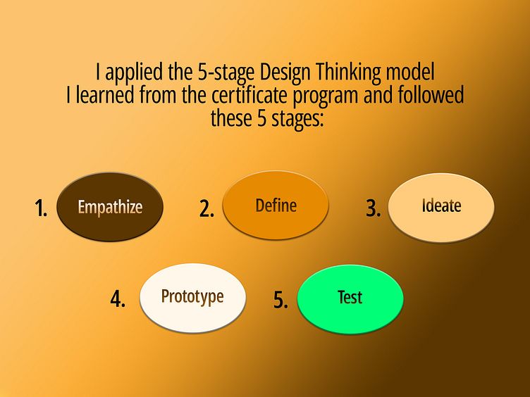
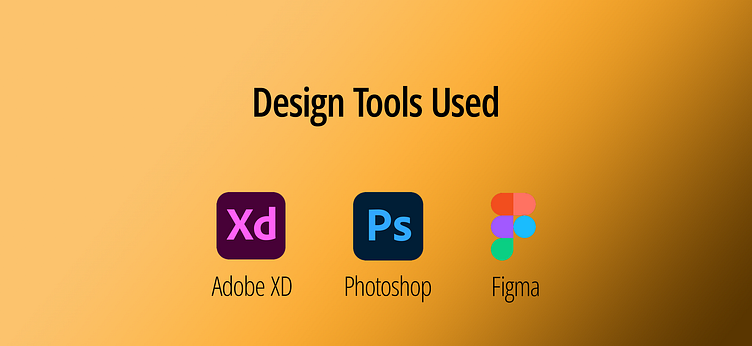
Design Process & Design Tools
The Problem:
Available pub websites have complicated UI design and confusing navigation, especially the menu sections are often cluttered. Lack of visuals and finding no price on the menu frustrates users.
The Goal:
Design a website that allows users to access menu items and their prices easily, find and choose different packages according to their needs, and make reservations.
My Role:
UX Researcher & Designer, leading from conception to delivery.
Responsibilities:
UX research, wireframing, low and high-fidelity prototyping, conducting usability studies, optimizing the design for accessibility.
Understanding The User
User Research: Summary
I conducted user interviews, secondary research, and competitive audit. With the help of my research findings, I created personas and user stories in order to empathize better with the users. I discovered pain points such as lack of visuals and prices of items on the menu, which prevent the users from reaching their goals.
Pain Points

Persona: Isabela

Problem statement:
Isabela is a team leader who needs to make reservations at a pub bi-weekly because she wants to build stronger ties among the team and have a fun time on fridays.
Starting the Design
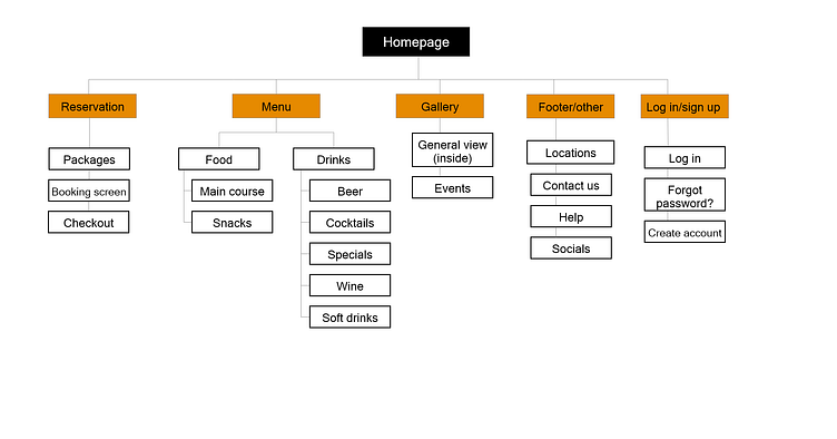
Sitemap
My goal was to make the navigation as intuitive as possible. Based on this goal and the pain points I discovered from research, I built my sitemap as shown.
Paper Wireframes
I sketched out paper wireframes for quick iteration. I experimented with different designs and created a refined version by selecting design elements I liked the most from each iteration.
I kept the pain points in mind, focusing on easier navigation on homepage especially.

Paper wireframe screen size variations
As users access the site on various platforms, I designed some variations for mobile. This way, I could keep the elements that improve user experience on a smaller screen and ensure the site is responsive.
Here are the screen variations for homepage and the menu page.

Digital wireframes - Home
Building on the refined paper wireframes, I built my digital wireframes and low-fi prototype.

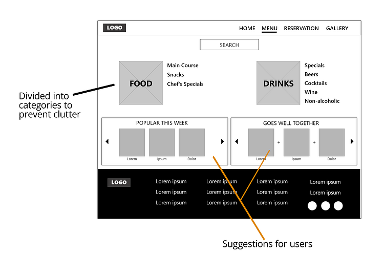
Digital wireframes - Menu
One of the most important pain points was the cluttered menu screens. My goal was to design a clear and easy to navigate menu page.
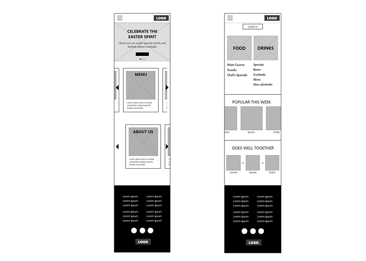
Digital wireframe screen size variations
As the users access our website through various platforms, I designed some screen size variations to keep the important elements of the design intact.
Here are the mobile versions of Homepage and Menu screens.
Low-fidelity prototype
As shown in the prototype, the user flow consists of checking the menu, choosing a package, and booking a reservation.

Usability Study
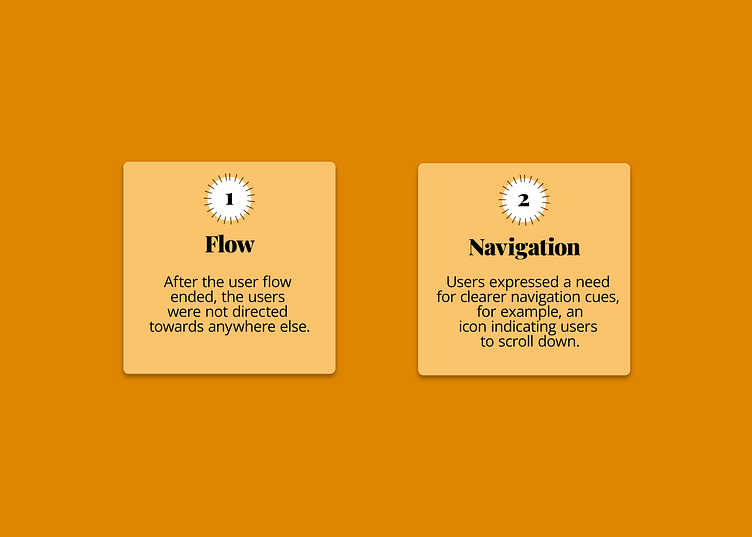
I conducted a remote, unmoderated usability study with 5 participants, using the lo-fi prototype above.
The main findings of the study are as follows:
Refining The Design
Mockups
To ensure the users had somewhere else to go after the flow was done, I added two buttons to the confirmation screen.

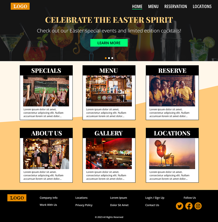
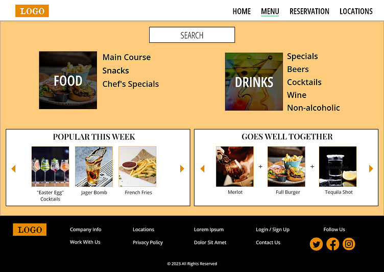
Mockups: Original Screen Size


Mockups: Screen Size Variations
Here are the mockups based on the earlier wireframes of the mobile versions of Homepage and Menu screens.
Adjustments were made according to further iteration upon usability study.

High-fidelity prototype

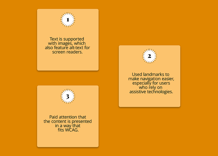
Accessibility considerations
Takeaways
Impact:
Most participants of the usability study stated that they felt happy and at ease with the clear site design and intuitive navigation.
What I learned:
I learned more about creating responsive design by designing screen size variations and by using tools Adobe XD and Figma offer. More importantly, I became more experienced on how to improve the user experience.
Thank You!
Thank you for reviewing my work for this project!
If you would like to offer constructive criticism and/or would like to work together, you can contact me through:
My LinkedIn page: linkedin.com/in/lorin-s-205465243
My e-mail: lorinsenan@gmail.com