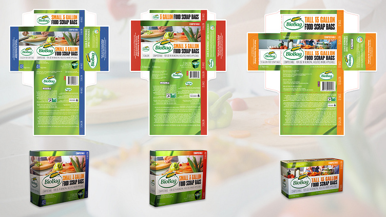
BioBag Retail Packaging - Kitchen Line
BioBag Retail Packaging
Print Design • Packaging Design • Pre-Press
______________________________
Role: Packaging Designer
Tools: Adobe Photoshop, Adobe Illustrator
Scope: Packaging for 12 Retail Products
Goals: The goal was to extend the new brand identity to easily recognizable packaging and convey the idea of a "green" product line.
Challenges: Due to regulations in using the words "compostable" and "biodegradable," there is a heavy amount of needed disclaimer text and associated regulatory logos. And some large retailers, like Amazon and Whole Foods, have specific specifications for selling products through their channels. The biggest challenge was combining these requirements while maintaining consistency and upholding the brand identity.
______________________________
BioBag updated its retail packaging as the first step in a new brand identity. The packaging also needed to be modernized as distribution expanded to include more national retailers to have better appeal to a larger, less niche consumer market.
The background leaf image represents the product line as a "green" alternative to regular plastic. The coloring also matches the brand's primary green color. Each product has a main image depicting its use and contains the brand's green and distinctive color. Some products have multiple quantity offerings—using the same photo shows the correlation.
