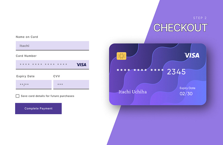
Credit Card Checkout Form
The second day of the Daily UI Challenge is the credit card checkout form. The good thing about it is that it is a simple checkout form with some added UI elements, like a credit card image.
The first step is to determine what color the website will use. Due to the fact that I am unsure of the brand's colors, I simply wanted a professional color for this page. And based on what I have learned about color theory, purple is a professional color that also goes with my website.
Second, we need to create a credit card. I searched for a suitable plugin and then added my page color to it with some more colors of the same hue.
Choosing an appropriate font for the website is the third and final step. Sans-Serif font Inter is appropriate for this page because it needs to be straightforward and easy to read.
I am aware that the page is far from perfect, but I still want to practice with different designs and gain more knowledge about UI and UX design.
#DailyUI

