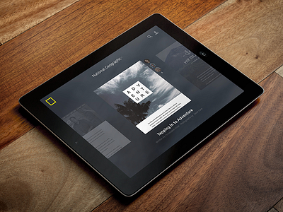
Medium iPad Concept
One of the projects I worked on at Medium was evolving the detail page, from both a creation and consumption standpoint. This is an old iPad concept that removes the meta-data from the editorial content, essentially allowing the user to "zoom" in and out of posts. The zoomed out state shows tools like Publication name, social proof, search, profile access, title and subhead.
This was before Publications were formalized, and is an example of what it could look like if you were to jump in to a hypothetical National Geographic publication on the Medium platform.
Disclaimer: I didn't design the mastheads of the stories, only the UI.
More by Brad Haynes View profile
Like


