Luxurious Apartments Logo Design
Idea
The whole visual portrait of the brand should rely on elegant people, filled with modern taste and simplicity. Use of terminology and visual image should follow “tasteful” and “elegance” related content.
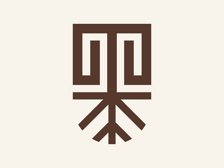
The upper part of the logo is a curved letter “T” combined with labyrinth semantics to provide a feeling of an apartment. The idea is that people relate it to an architectural sketch in the back of their minds.
The lower part is the “root” of a plant. It provides an opportunity for the upper part to “grow” because our building is named Terra which means Ground / Zemlja.
About Brand
Terra Luxe Residencies is an exquisite brand that offers luxurious
and premium apartments for a one-night stay in Belgrade Waterfront.
With an elegant and simple design, their apartments exude
a professional and sophisticated atmosphere that is sure to impress
even the most discerning travelers.
The apartment is thoughtfully crafted to provide the ultimate
comfort and convenience, featuring modern amenities and a relaxing
the ambiance that will make guests feel right at home.
Terra Luxe Residencies prides itself on providing top-notch service,
ensuring that each guest's stay is nothing short of exceptional.
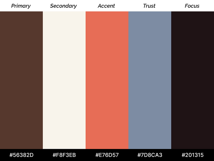
Colors
5 colors represent the smooth and enhancing visual identity of the brand. Our target was people who wanted to pay a bit more to get a hotel-like experience in the most popular place in Belgrade.
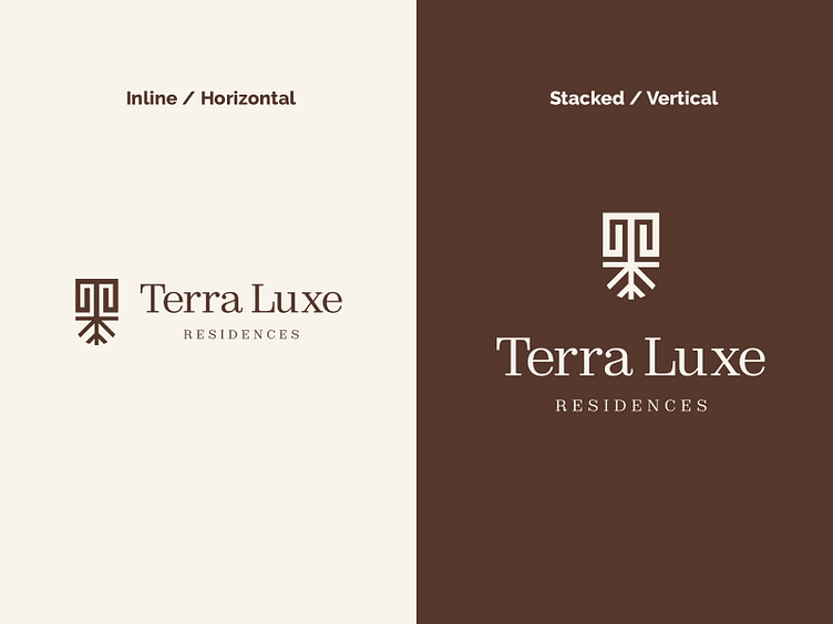
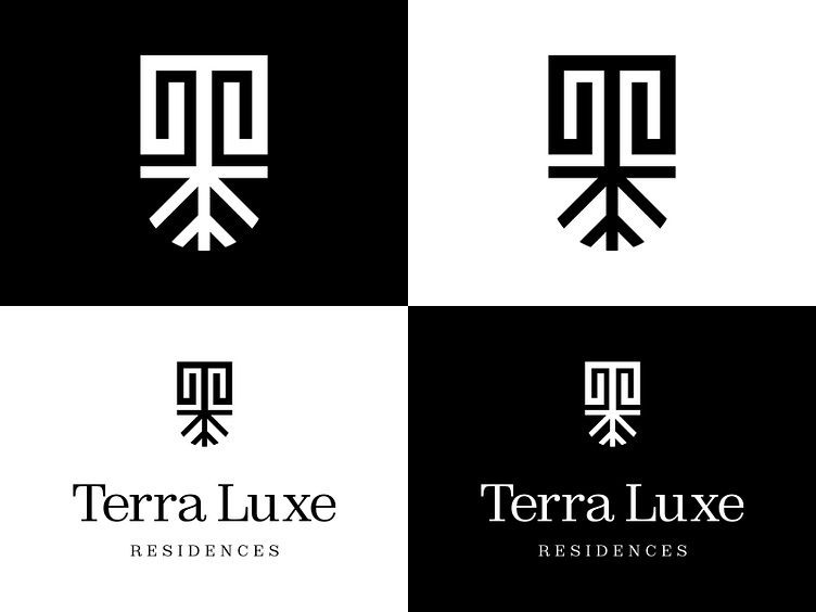
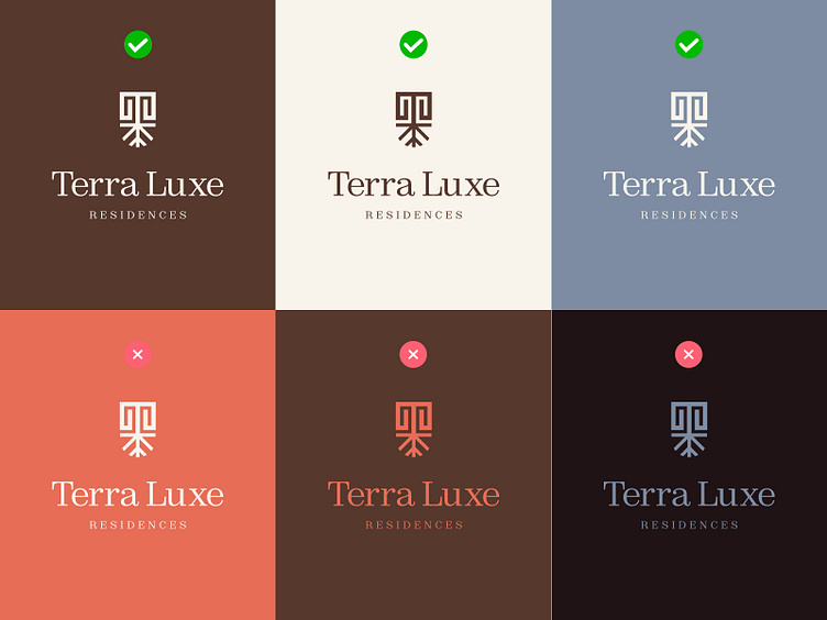
Usage
Examples of how client should use the logo between the different surfaces to follow the brand line and stay on the defined identity.
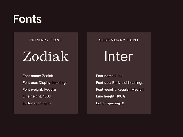
Typography
We have two font choices: primary and secondary. They follow the identity by keeping both the premium look and modern touch.
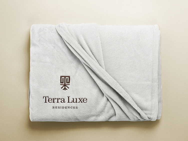
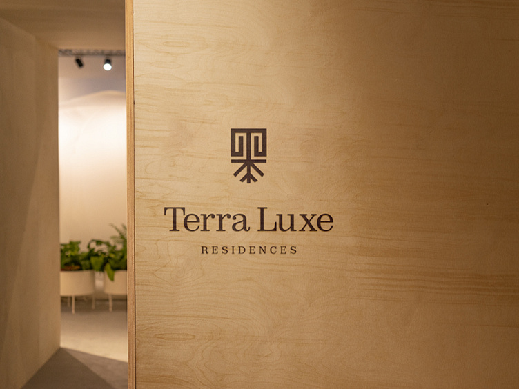
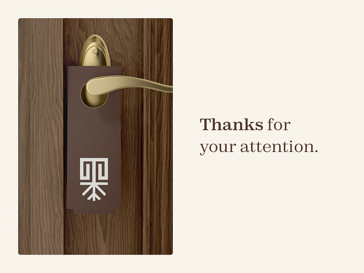
Mockups
Because every client needs to see the work application on different surfaces.
Copyright © Aleksa Simeunović 2023
