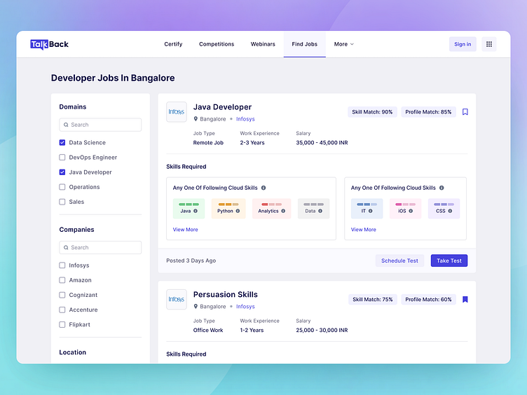
Job Finder Dashboard, Ed-Tech Platform
Hii Dribbblers,
This is in continuation of the previous shot of our AI-enabled automated job portal.
In this shot, we went one step ahead and created a design for a job finder screen.
Our aim was to make the screen informative and improve the user experience.
We did so by adding filters at the left side of the screen and highlighting the skills required by the recruiter.
What are your thoughts?
We are available for new projects!
We are experts in:
Feel free to reach out to us at: business@octet.design
For more - Look at us on Octet Design Studio
Follow us on: LinkedIn | Behance | Instagram | Twitter | Medium
More by Octet Design Studio View profile
Like
