Spry Skin and Wellness - Web Design
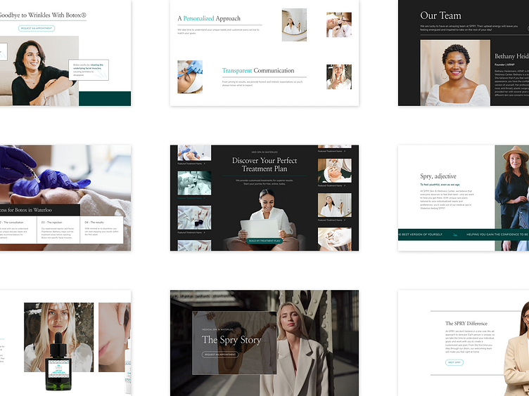
This site was designed with a high-contrast layout in mind. Equal parts moody and modern, this site's aesthetic was perfectly in keeping with Spry Skin and Wellness' youthful, authentic vibe.
Wanted to the center component, the hero banner, to be the only stop for featured treatments and the treatment planner callout tool. It would also serve to guide users to their ultimate goal: an interest form that matches patients with their perfect treatment.
It was vital to include lots of information without overwhelming new users. We crossed this hurdle by combining dense components like the aforementioned hero and with lots of of white space, big images, and boxed, organized text. These serve as eye breaks for anyone scrolling through the site.
Made with 💜 in Kansas City
Website / Get a Quote / Instagram / Clutch
