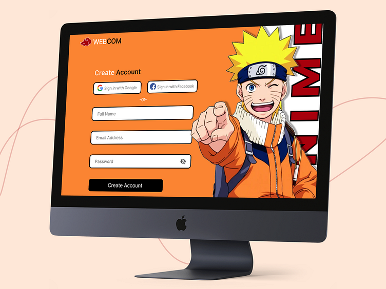
Anime Website Registration Page
I am taking part in the Daily UI Challenge, and this is the first challenge that has been assigned to me. The challenge was to make a sign-up page.
Determining which category to include on the sign-up page is generally a challenge. To create a sign-up page, I then chose the category of "Anime."
As everyone is aware, the anime industry is flourishing right now. And Naruto is undoubtedly the most well-known figure in the anime world. Anyone who watches anime, whether they are a child or an adult, is certain to be familiar with Naruto. That is the reason I selected Naruto as the character to be on the sign-up page, which is one of the most important pages on the website.
It is simple to choose a font because I only need something straightforward but still legible enough to fit with the Naruto image. "Inter" is a straightforward font that is easily readable and fits the character of Naruto perfectly.
I have also used typography to its fullest by writing ANIME behind Naruto's image. which gives a sense of mystery to the website as the ANIME word is slightly hidden behind Naruto.
I have a hard time choosing colors because I do not know what to do with them. Then I decided to take a chance and combine the logo's reddish hue with Naruto's dress's complementary color.
That concludes the First Website under the UI Challenge. Even though I am aware that it has some flaws and is not the most beautiful website you have ever seen, it is one of my earliest works.
#DailyUI
