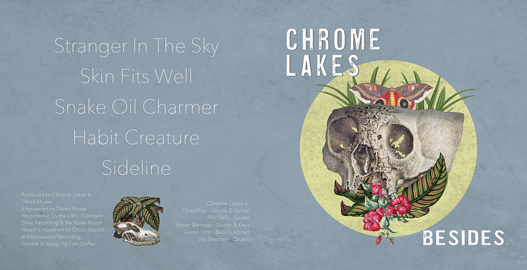
Album Design: Seattle Band Chrome Lakes - Besides EP
Recently, I was lucky enough to be asked to work on an album cover and CD design for Seattle band Chrome Lakes for an upcoming EP release. For those curious, I wanted to share some high level overview of the design process, as well as source images that went into the final design.


I'm really grateful to the guys in the band that I had a lot of creative freedom to try different ideas for this design. I knew they were interested in some of the digital collage work I'd done and I was familiar with their music, but beyond that - I basically had free reign.
In starting to look through some of my source images, this old skull illustration struck me and kept suggesting itself as something to work with.
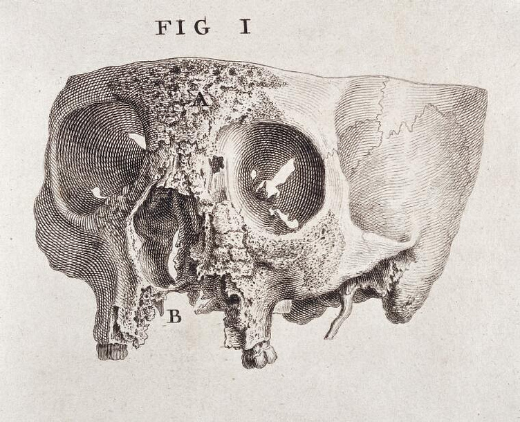
I'm often drawn to detailed, realistic, scientific illustrations and this was an image I'd been sitting on and really hoping I could use for a project. Skulls obviously have a long history in rock 'n roll iconography, and to be honest I find a lot of designs that are done with them to be a bit overdone. But aspects of this particular image really struck me. The first thing that grabbed me was the detail and precision in the illustration. Though it's a monochromatic image, there's so much depth and texture that really draws the eyes in and invites the viewer to explore all the cavities, cracks, and chips.
I also loved that the skull had a broken, fractured look to it. That on its own suggested some kind of story and or "previous life" that the object had been through. The fact that the skull had a battered look where it was missing teeth, was completely missing the lower jaw, and seemed to have wear and tear around the nasal cavity was really interesting to me, and immediately separated the image from more typical "rock 'n roll skull" designs.
I also really liked the fact that the cranium of the skull looked as though it had been cut clean off. That aspect of the image suggested something done deliberately by a person - whether that was for the purpose of scientific study or something a bit more macabre - like using the skull as a kind of receptacle to hold something. All of these aspects suggested a lot of "play" to me from a design perspective. What if the skull was repurposed as a kind of "bowl" or something? What would it be holding? Where would someone have found a skull like this - somewhere outdoors? On a hike? Would it have been overgrown with plants and vegetation?
I knew I wanted to incorporate plants with some pops of color into the design to contrast with the skull as a centerpiece. Browsing through source images for plants, I found several that I thought might work.
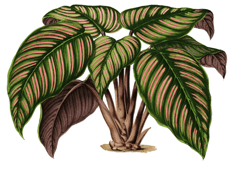
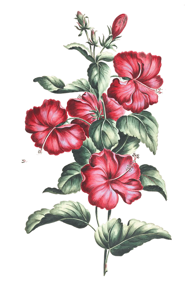
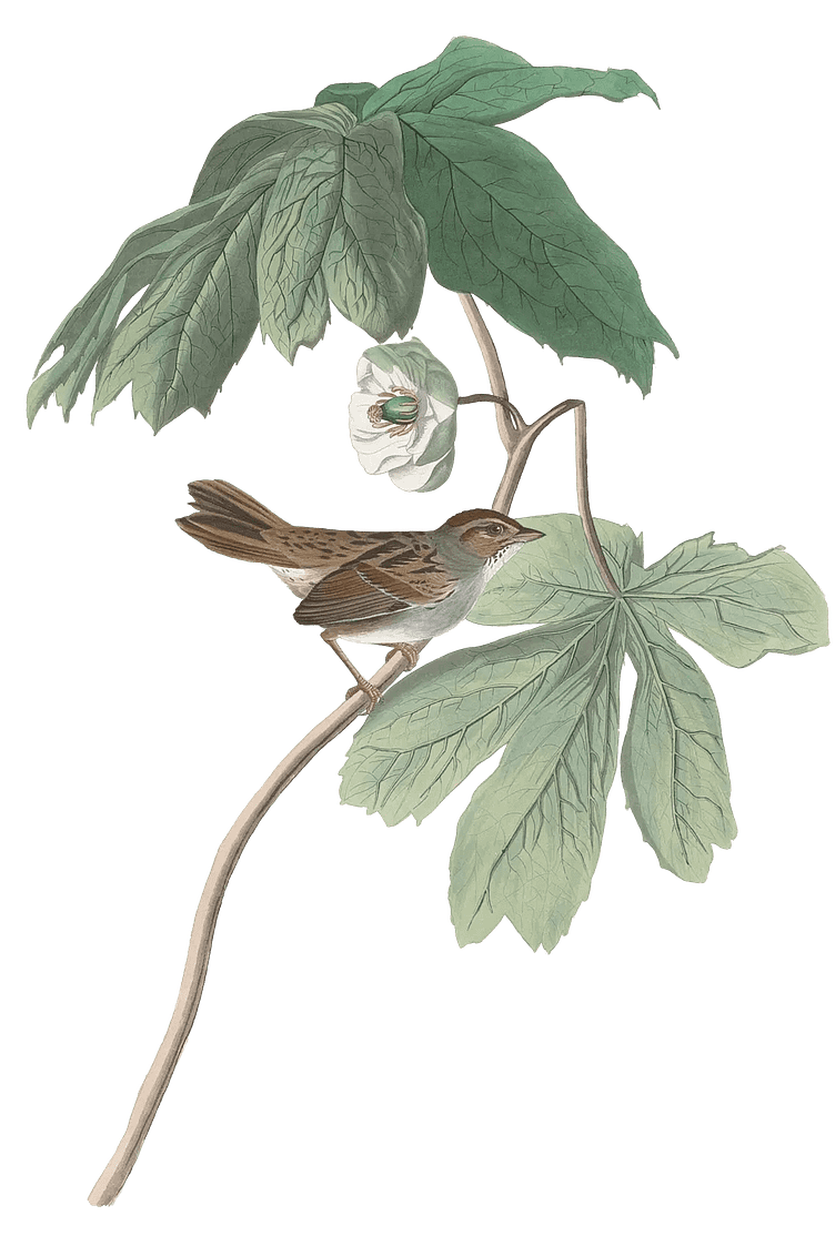
Having these illustrations that seemed to fit with the skull, I worked on experimenting with initial compositions. I wanted an "overgrown" aspect to the overall design - where plants and vegetation were seeming grow over the skull and frame it. The fact that the skull was missing the lower jaw provided a nice space to explore this idea. I also wanted to explore the idea of things growing within the cavity of the skull since the top was missing - almost like the skull was providing a new home for plants and wildlife out in nature. Combining these ideas, I came up with the initial design that I sent over to the band below.
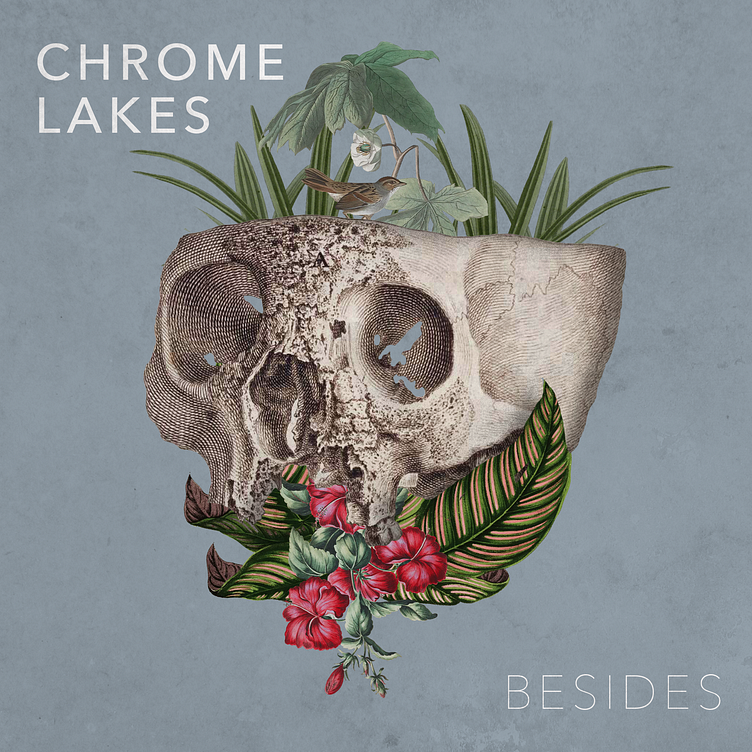
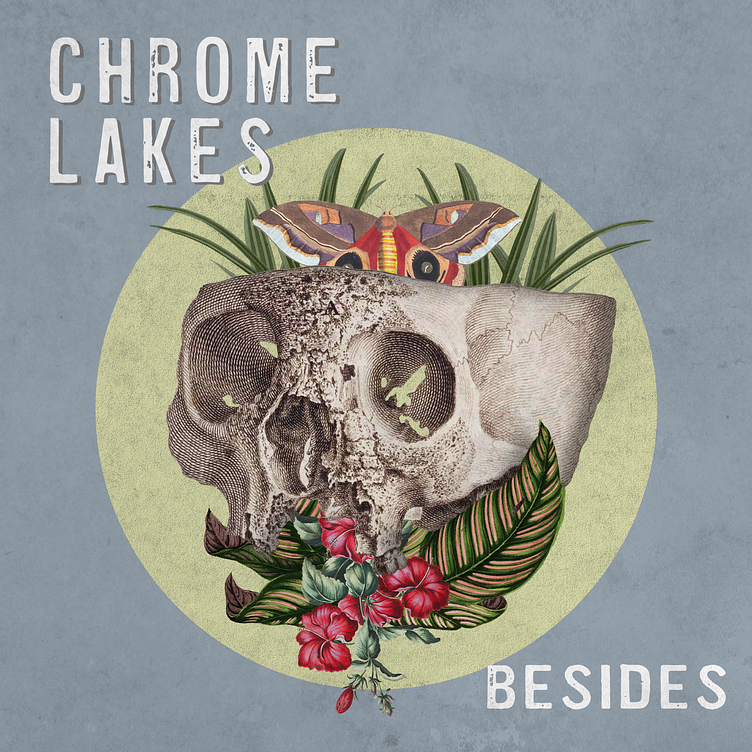
After some discussion, we agreed that the skull was a strong centerpiece, and the overall composition had some strengths to it, but we wanted to play with some alternatives around this theme. This mainly involved experimenting with different vegetation and objects below, and coming out of the top of, the skull.
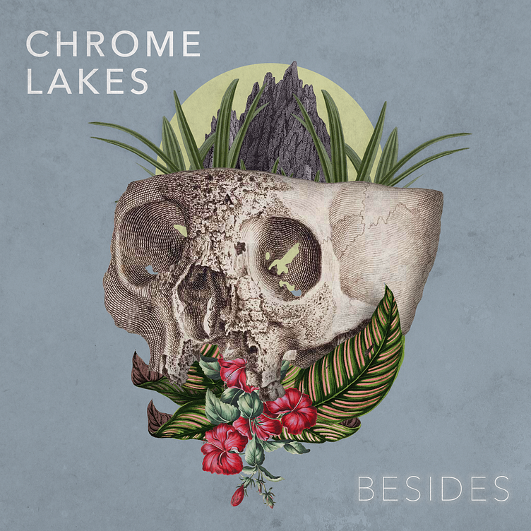
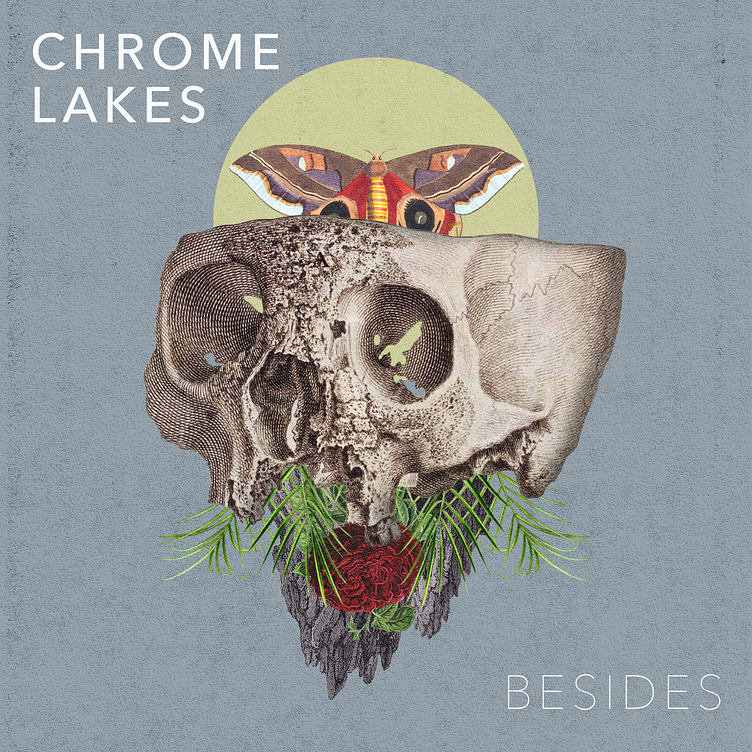
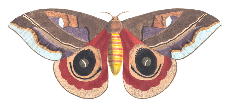
In the end, we ended up combining elements from several of the alternates for the final layout below. The moth ended up being a strong element - adding pops of complementary color, and it also provided motion to the overall image, almost like it was emerging from the top of the skull.
Along with trying out some different fonts, we landed on using lots of overlay layers to add grit and texture to the overall composition that I think really complements the skull as the centerpiece, while allowing the pops of color from the moth and flowers to shine through.
The final layout sent to CD pressing is below! This was such a great project to work on, and I really appreciate how collaborative and supportive the band was throughout the process. Hoping to do more of these in the future. Thanks for reading!