Gymly: Empowering people to stick to their goals
This case study is based on a problem statement provided by the startup Gymly, a SaaS solution for gyms and their members.
From Gymly's problem statement:
Users with a gym membership often have ambitious goals but never feel empowered to reach them. They want to go to the gym more often but face challenges like work that prevent them from going.
Research conducted by Gymly confirms that time management, work/life balance and planning are holding users back from going to the gym. Some users also signalled they felt unsure about how they could (reach their goals) research their goals.
More users going to the gym means more engagement. This project aims to achieve more engagement through Gymly. We measure success with the following metrics: number of check-ins in the gym, number of active weekly users, number of cancellations and the number of reservations.
Research
Good intentions, forgetting,
and finally cancelling
Examine further what keeps people from going to the gym and how these issues could be tackled. Two interviews were conducted with people struggling with mentioned issues. While both interviewees have Gym memberships, they only sometimes use these, even though they would like to. A prominent cause mentioned is that it often falls through unless a visit is explicitly scheduled.
When prompted about whether they go to the gym together with someone else or know someone at their gym, an interviewee states that they don't. Unlike the team sport they participate in, they have nothing binding them to their gym.
Furthermore, it is noted that at this point, their gym membership is a waste of money, and they might cancel it if they go to the gym less often.
Persona
It can be hard to start and even harder to commit
"I want to become the best version of myself,
and the gym is where I can make that happen."
Jamie Black, photo by Jackson James on Unsplash
A persona was provided as part of the initial problem statement:
Jamie, 24 years old, is a high performing professional and often busy. His busy schedule makes it challenging to find time for consistent workouts.
He wants to improve his overall health and well-being. He hopes to meet new people and make friends with similar fitness goals during this process.
He struggles with staying motivated and keeping up with a fitness routine and often feels lost and unsure of what to do.
User Flow
Jamie's path to finding his goals
and a welcoming community
Defining goals and social connections can help users like Jamie improve their health and stay active. Thereby increasing the number of check-ins and preventing membership churn.
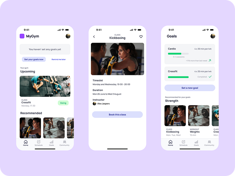
When landing on the home page and a user hasn’t specified any goals, they’ll get prompted to do so. When there are active goals, these will be shown on the home page. After creating a new goal, the user is forwarded to a page with a more detailed overview of their goals.
While defining goals is essential, Jamie hopes to meet new people and make friends with similar goals. A great way to meet new people is in class. After signing up for a class, the user continues to the class home, where aside from essential information, a method is provided to communicate with classmates, the class community.
Wireframes
Keeping your activities and goals
in your sights
Although goals are optional, users are prompted to define their goals if they haven't yet. When the user has defined goals, a summary is displayed on their home page. Furthermore, any upcoming classes are listed prominently on the home page.
The goal page provides a more detailed overview, as well as proposals for new goals through classes, workouts, and programs. For users with existing goals these suggestions are tailored to their active goals.
Classes and certain groups, or people sharing similar goals have communities to foster the development of social connections and encourage better commitment through community.
Visual Design
A White Label Experience:
Gymly is the new Back
It's essential to consider that Gymly aims to provide a white-label experience. The visual design should be separated from the branding and fit into the branding of the client gym. Therefore, relatively safe colours were used in combination with unopinionated visual elements. A visual design which works with (almost) everything.
The colour palette provided in the project briefing was used accordingly to their intended purpose, using ultramarine blue as primary, indicating success or element interactivity. The grey shades were for text and borders. And the shades of jade green and red indicated a positive state. In our case, the user has confirmed to go to a particular class.
Finally, the prescribed typography guidelines were followed for predictability and simplicity.
Conclusion
Unfortunately, usability testing and subsequent refinement have not been performed due to time constraints.


