Case: IoT app UI/UX overhaul
Redesigning with the user in mind
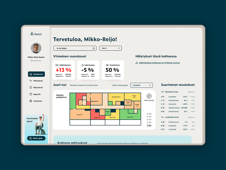
ReIoT represents a cutting-edge SaaS and IoT solution tailored for real estate managers, premise managers, maintenance teams, and tenant representatives. This comprehensive platform facilitates real-time tracking of indoor temperature, air quality, humidity, and an array of other critical measurements for buildings and lots. The overarching business objective is to streamline tracking and optimization processes while empowering users to make sustainable choices.
However, the business faced challenges stemming from a lack of customer and user insights. Additionally, the client expressed a desire to explore mobile responsiveness solutions for an application primarily designed for desktop use.
Our goal
Our objective was twofold: first, to develop a responsive solution allowing for dashboard customization to meet diverse user group needs, and second, to design a mobile-friendly version of the desktop application.
Methods & tools
Throughout our design process, we relied on Lean Service Creation canvases as the primary tool, complemented by extensive user interviews, user testing, and agile methodologies, including lightweight sprints during ideation workshops. The final designs were meticulously crafted using Figma.
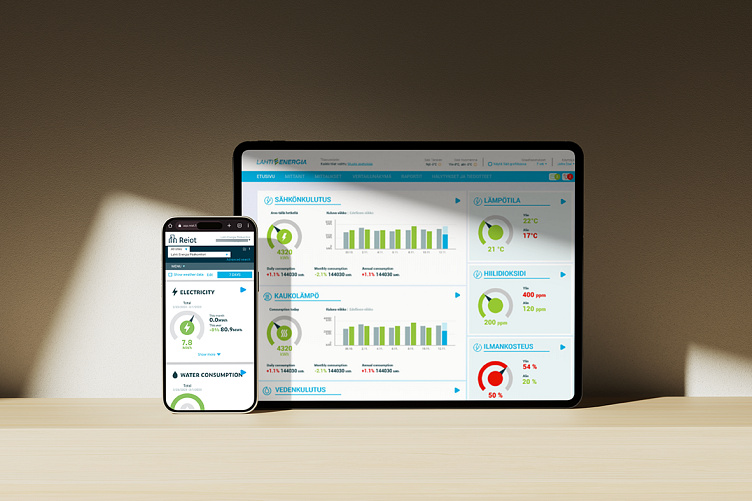
Above: The original dashboard on mobile and tablet
Key findings
User interviews revealed a common challenge among users—the application was laden with unfamiliar terminology, making navigation difficult. Page headings often resembled one another, prompting users to memorize rather than intuitively locate essential features. Notably, the absence of a support or FAQ section and an onboarding flow for new users was identified through both user interviews and a detailed heuristic analysis.
Solution
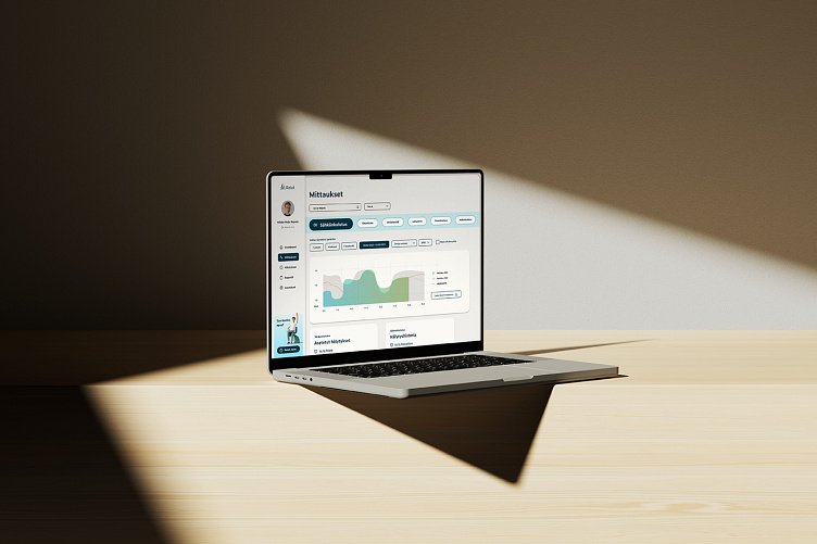
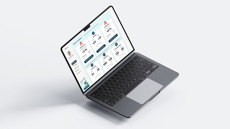
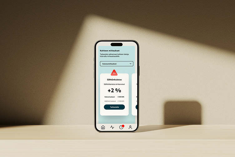
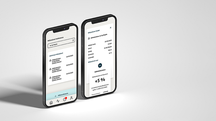
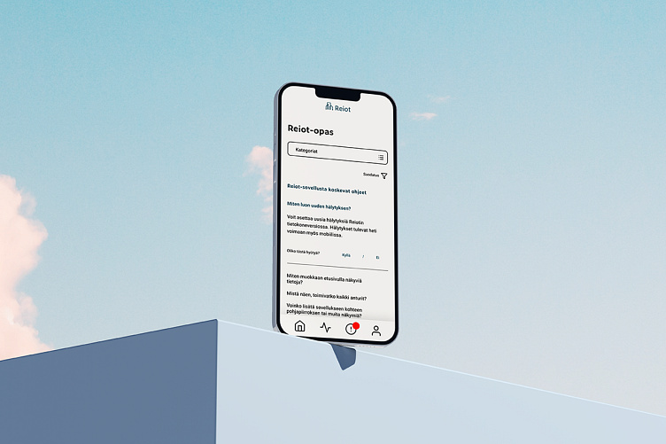
To address user and client concerns, we embarked on a comprehensive redesign of both the desktop app and a mobile version. This approach allowed us to create an intuitive mobile flow without unnecessary clutter, ensuring all features remained accessible to power users on desktop. Our solution introduced an onboarding flow and in-app guidebook for quick answers to basic questions. Navigation was clarified, and the app's color palette was simplified to enhance communication of features such as warnings and notifications.
Key changes
A pivotal feature, the ability to create and customize reports through the app, was identified for enhancement. However, user feedback revealed a division in preferences: management experts and real estate managers emphasized its necessity, while tenant representatives and premise managers reported infrequent use on-site. This division aligned with distinct user profiles: those primarily accessing the app from a desktop in an office and those requiring a portable version for on-the-go decision-making.
In response, we decided to exclude this feature from the mobile version, focusing instead on optimizing the dashboard and notification features to meet the specific needs of mobile users. This strategic adjustment ensured a more tailored and efficient user experience across different contexts and user profiles.
Let's chat maybe?
I'm open for remote projects big and small - send me a message or email me at kata.naaranoja@gmail.com :)
