PeopleFinders — Landing Page Hero Concepts
How do you convince visitors your website is worth their time? There are so many elements that a top-notch landing page design needs, and making those elements the "best" they can be often depends on what your landing page goals are.
For this design exploration I had a lot of fun playing around with different visual elements, and seeing how the composition's mood shifted with different uses of colors, font sizing, spacing, imagery and position of elements.
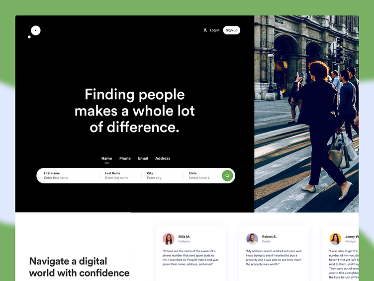
I tried to keep it simple in this first version. It’s not too text-heavy, but still manages to persuade users by noting a few key points about its top-notch search feature. Visitors come away knowing that PeopleFinders is an all-in-one platform to search public records that is easy to use and trusted by many.
Why this landing page works:
Clean Interface: The user-oriented headline is just a few words, for example, and the page relies on simple graphics and short paragraphs to communicate the trial's details and benefits.
Concise CTA: There are only a few fields you need to fill out before you get started. All of this makes it easier for you to quickly get started searching information online with their search tool.
What could be improved:
Emphasize Security: A few words that speak to site security would improve this hero section since the number of customers is already stated further down on the page. Additionally, it would eliminate friction for visitors with security concerns.
Include an FAQ: Testimonials are great, but sometimes customers have a few concerns that could be answered quickly with an FAQ section. That way they can decide whether or not to sign up without having to leave the page to search for answers.
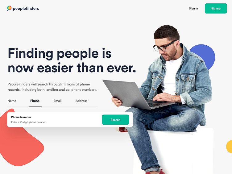
This second version offers up a beautiful and playful landing page. It is person-centric and simplifies things in people's lives, so it taps into the ease-of-use trend.
Why this landing page works:
Use of Color: The use of bold colors quickly draws visitors in and makes the hero stand out.
Prominent CTA: You can’t miss this giant search bar and green CTA. Pages are often filled with visual elements, so putting the CTA inside a large box immediately draws the viewer in.
What could be improved:
Advantage Over Competitors: PeopleFinders is not the only people finder database in town. They could highlight what sets them apart from a competitor like TruthFinder.
Could be Difficult to Read: The light gray text on gray background may be harder to read for some.
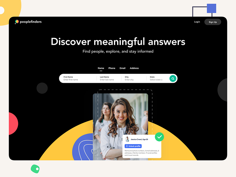
The last version is a simple, concise hero section that offers a personalized experience. Overall, the layout is clean, inviting, and informative.
Let me know what you think in the comments.
Cheers!