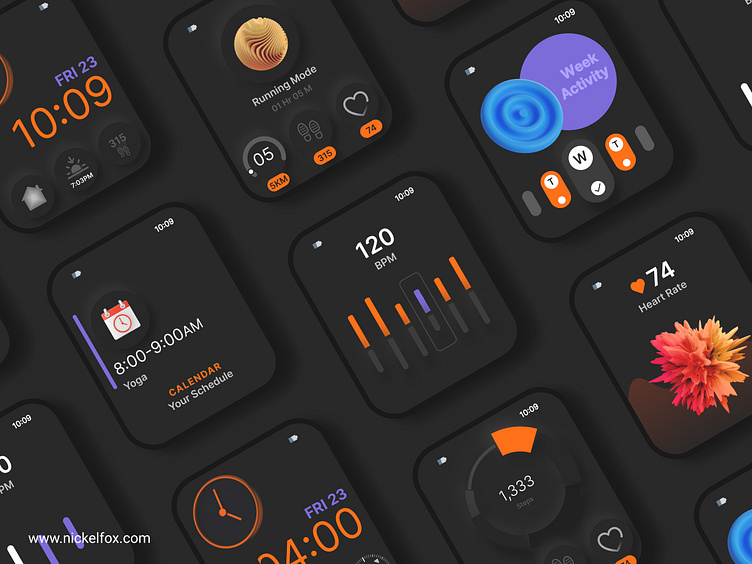
Smart Watch UI
Hi creatives,
This is my exploration of watch interface design. Design focuses on healthcare . UI represents the health app pages in dark mode.
Have an idea💡? let's work together 🤝
sales@nickelfox.com | WhatsApp
Discover more about us at Nickelfox.com | Youtube | Twitter
For Freebies, Click Here
Dark mode UI design for health apps on smart watches enhances the user experience by improving usability, reducing eye strain, optimizing battery life, and enhancing readability and focus.
🎨 Colors
🎨#282828: This deep black color is often associated with elegance, professionalism, and sophistication.
🎨#FE6F19: The vibrant orange color signifies energy, enthusiasm, and creativity. It is an attention-grabbing hue that can evoke a sense of excitement and warmth.
🎨#534F4F:Grey is often utilized for backgrounds, creating a sense of harmony and allowing other elements to take the spotlight.
🎨#7A6BD8: Purple is a color that represents creativity, spirituality, and luxury. Purple can be used to add a touch of sophistication and visual interest to your design.
Font
Inter: The Inter font is highly regarded for its readability and legibility across various digital interfaces, including smart watches. Its design features make it an excellent choice for enhancing the readability score of text on smartwatch screens.


