Gymly App: Case Study for Gym Goers 🏋🏻♀️
Introductions
THE BRIEF > 💨
This is a real world case study for a startup: Gymly. This is a motivational gym app that connects gym goers with gym establishments.
THE INSPIRATION > 🐕
My mood board: Motivational sayings that boosts confidence and fuels that inner energy. It portraits images that are strong, fierce, and show that you-can-do-anything attitude. Level up your fitness!
Project Overview
THE GOAL > 🥅
Designing a motivational gym app for fitness enthusiasts for all levels that go to the gym, which in turn also boosts ROI for the gym establishments.
THE PROBLEM > ⚠️
Users with a gym membership have often ambitious goals but loose the momentum to reach them. They want to go to the gym more often but face challenges like work that prevents them from going.
THE CREDITS > 🎥
• UX / UI Design by: Ann Marie Manfreda
• Tools used: Figma, Notion
User Research
THE USER > 👩🏻🦰
Gym goers with all levels of fitness that like to track their progress but also serves as a motivational purpose for those that need a boost.
THE INTERVIEWS > 👩💻
I reached out to family, friends, and my fellow gym acquaintances and chatted with them about their overall experience, their pain points and challenges, hopes, dreams and fitness. Reasons that some were discouraged from visiting the gym more often were: overly crowded, classes booked full, can’t find parking, and more which I list below: 👇🏻
THE PAIN POINTS > 🤕
• Too crowded
• Classes booked up
• Can’t find parking
• Unsure on equipment use
• Time
• Location
• Costs
Market Research
THE COMPETITIVE ANALYSIS > 🔍
As a gym enthusiast myself, I have several apps I use for fitness. There is not 1 app that does everything. There’s apps specifically to track fitness and overall health, others are more of a social interface which shows you and your friends activities and can engage in challenges, while others are specifically for finding a nearby gym, booking and paying for a class. Apps I’ve researched: MindBody, Strava, Apple Fitness, Garmin Connect, GymShark, and the YMCA app (which is the White Label I choose to do).
Overall, I made notes on which I’d like to carry over through my designs:
• Graphs/Charts for tracking progress,
• Badges for achievements,
• Important Markers: Calories, Distance, Heart Rate, Steps, Pace, etc...
• Calendars for schedules and alerts
Ideas I came up with after conducting user interviews and researching:
• Live time tracking for gym attendance (think: Google Business)
• Video Library for follow along workouts for all levels (put for future endeavors)
• Check-in and wallet features for easy access (no more fumbling to find your ID)
• Class scheduler with calendar alerts
• Favorites tab for easy access to rebook those classes with ability to add notes
THE USER PERSONA > 🏋🏻♀️
Jamie Black is a young 24 year old professional, who is enthusiastic about going to the gym and seeing his results progress overtime. However, he sometimes gets bored or discouraged from going and needs an extra push of motivation. He also lacks time in his schedule to visit the gym and classes are a great way to keep him accountable when he meets new friends with similar fitness goals.
User Flows
THE USER FLOW > 🏊🏻♀️
I mapped out 4 different user flows as you can see from the slideshow below.
1) Onboarding & profile setup
2) Gym check-In scan
3) Class schedule
4) Leaderboard stats
Ideation, wireframes, prototype
THE WIREFRAMES > 🖼️
To go along with my user flows, I created my wireframes for each of the navigational steps.
1) Onboarding & profile setup
2) Gym check-In scan
3) Class schedule
4) Leaderboard stats
Ideation - Prototyping
THE PROTOTYPE > 🕹️
For my prototype, I show the onboarding process for a new user. They create an account and then land onto the home screen and taps on the "Check-In" link which opens a modal so they can scan their membership card at the gym.
Ideation - Visual Designs
THE OVERVIEW >
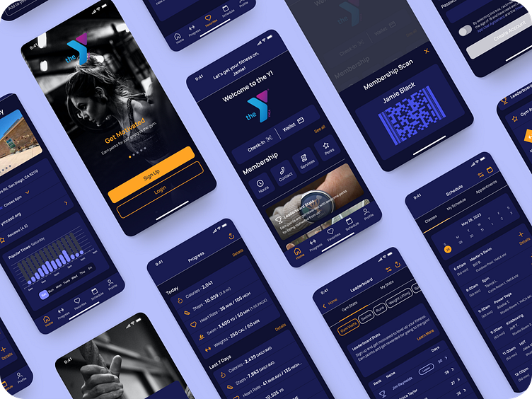
I created a White Label use case for the Gymly app and used the brand (which I am a current member of): The YMCA. The screens are designed in dark mode.
THE ONBOARDING SCREENS > 🤳🏻
Below are my high fidelity screens for onboarding, account sign up, and membership scan with success notification modal.
1) Splash Intro
2) Sign Up/ Login
3) Create Account
4) Success Notification
THE OTHER TABS > 📊 💜 📆 📸
Below are my high fidelity screens for all the other tabs.
1) Tabs
( Progress, Favorites, Schedule, Schedule > Class Details, and User Profile)
THE OTHER TABS > 📊 💜 📆 📸
Below are my high fidelity screens for all the other tabs.
1) Progress Tab
2) Favorites Tab
3) Schedule Tab
4) Schedule > Class Details
5) User Profile
THE FUTURE > 🔮
1) Workout Video Library
MORE DESIGN FILES > 🎞️
1) Visual Designs in black and white.
2) Component library: icons, buttons, form fields, toggles and more.
3) Components for prototype animation scrolling.
Thank you! 👏
Thank you for your time in reviewing my case study.


