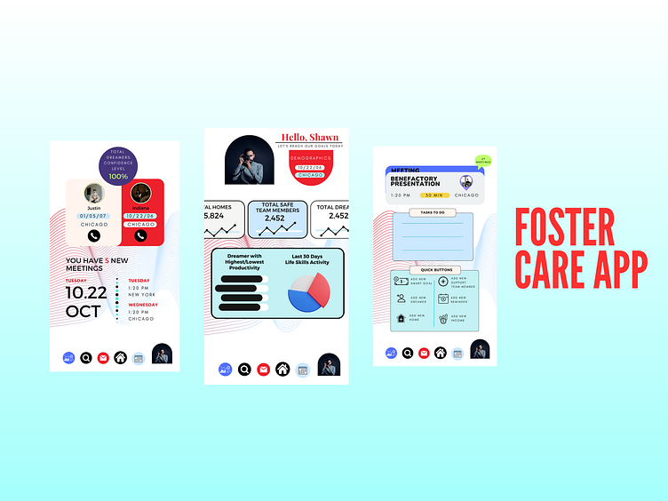
DASH APP - Coach View
When designing the coach screens for a UI/UX experience that includes calendar functionality, calendar options, data tracking, and graphs, it's crucial to prioritize usability, efficiency, and a visually appealing interface. Here's a description of the design approach:
Calendar Functionality:
The calendar screen should provide a clear and intuitive overview of the coach's schedule, allowing them to easily manage appointments, events, and tasks.
Implement a clean and organized calendar layout that displays dates, times, and any scheduled activities.
Provide intuitive navigation options, such as swipe gestures or clickable buttons, to navigate between days, weeks, or months.
Enable the coach to add, edit, and delete events directly from the calendar view for seamless schedule management.
Consider incorporating color-coded labels or tags to differentiate between various types of events or clients.
Calendar Options:
Include additional calendar options to enhance the coach's productivity and flexibility.
Offer customizable views (e.g., daily, weekly, monthly) to accommodate different preferences and scheduling needs.
Provide filtering or search capabilities to help the coach quickly locate specific events or clients.
Implement reminders or notifications to alert the coach of upcoming appointments or important tasks.
Allow the coach to sync the calendar with external platforms, such as Google Calendar or Outlook, for seamless integration with their existing workflow.
Data Tracking:
Create a dedicated section for data tracking, where the coach can record and monitor important metrics or progress related to their clients' performance or goals.
Design intuitive input fields or forms that allow the coach to input and update data easily.
Consider incorporating dropdown menus, sliders, or checkboxes to streamline data entry and ensure accuracy.
Provide visual cues or progress indicators to help the coach gauge the progress of clients or identify trends over time.
Include data visualization elements, such as charts or graphs, to present data in a visually compelling and easy-to-understand format.
Graphs:
Design visually appealing and interactive graphs that represent key performance indicators, trends, or comparisons.
Select appropriate chart types, such as line graphs, bar charts, or pie charts, based on the nature of the data being presented.
Implement interactive features, such as tooltips or zooming capabilities, to enable the coach to explore specific data points or time periods.
Ensure the graphs are easily readable and accessible, with clear labeling and appropriate scaling to convey accurate information.
Consider providing customization options, such as the ability to choose different time ranges or data filters, to cater to the coach's specific needs.
Throughout the design process, prioritize user testing and feedback to refine the UI/UX and ensure a seamless and intuitive experience for the coach. By combining user-centric design principles, efficient navigation, clear data presentation, and visually engaging elements, the coach screens can empower coaches to manage their schedules, track data, and analyze insights effectively, ultimately enhancing their coaching capabilities.
