Sprocket Android App Icon 2014-2023
7
for
Retrographic
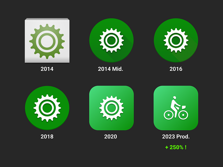
Needed this for a presentation on marketing. Summarizes a decade of learnings from our first app icon to where we got today with Play Store Experiments. A lot of things were not obvious at first - from having the symbol be white, the brightness of the background and ultimately the optimized acquisition of showing a bicycle for our cycling app instead of a bike sprocket :)
If you like it, don't hesitate to click "L" 💗 or "F" + "Follow"
Sprocket Bicycle App on Android Sprocket Bicycle App on iOS Sprocket Bicycle Blog on Instagram Sprocket Bicycle Blog on Tumblr Sprocket Bicycle Blog on FB