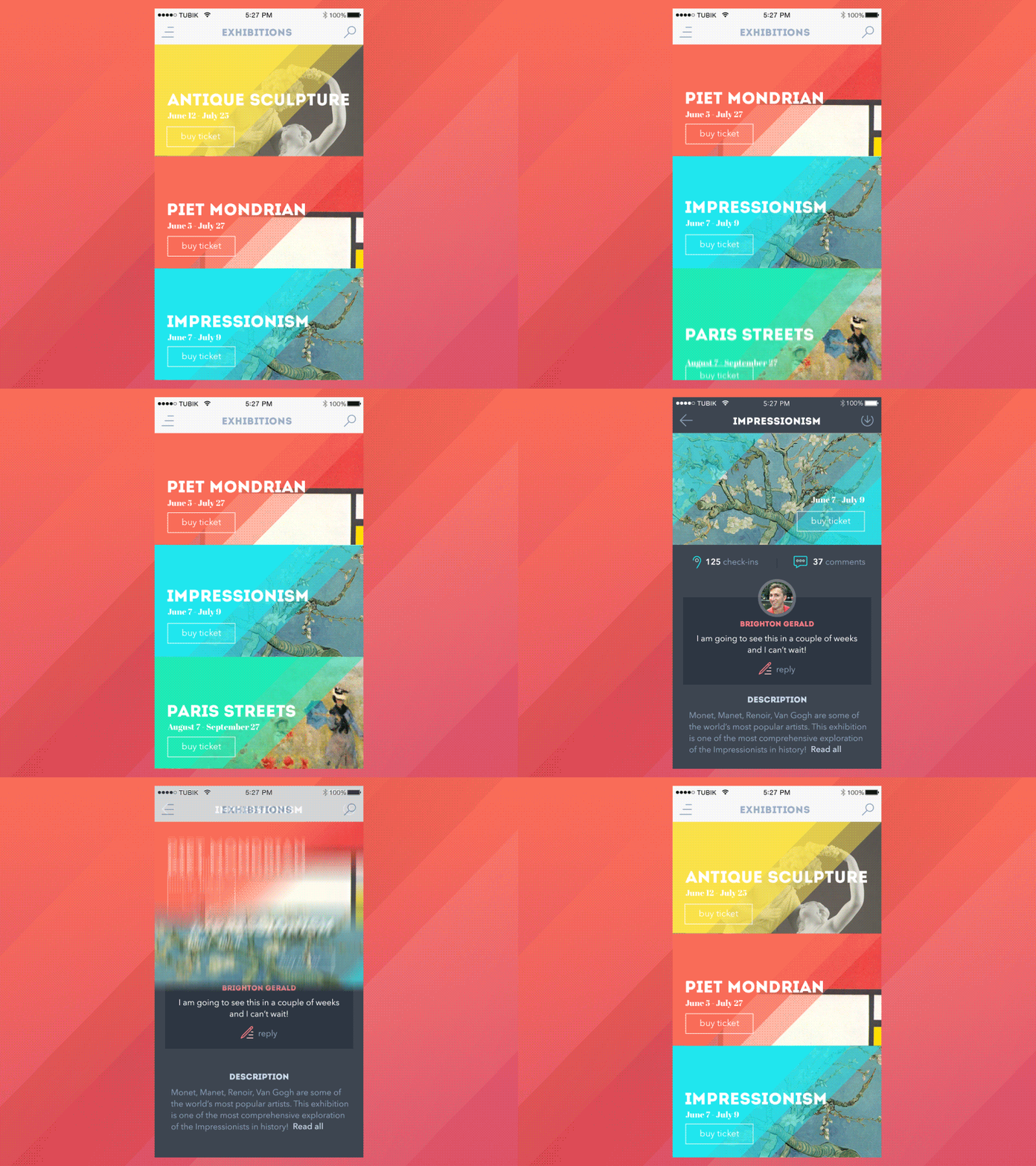
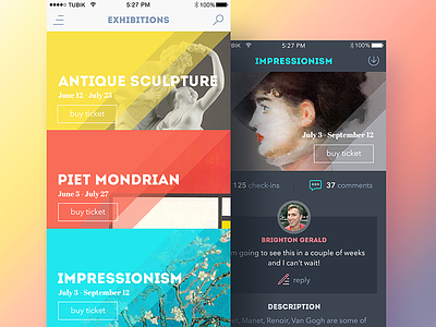
GIF for Art Gallery App
Good Thursday to everyone! Today is a very important and busy day for us as the week comes to the end. What are we doing here at Tubik? We do thorough UI/UX research as part of design process to complete our projects making wise and lucky decisions. This time we want to show you how we resolve an interaction task. We say that too much animation confuses a user but if a motion accent supports the general layout it brings better conversions. Here we highlighted the vertical movement with colorful diagonal lines. These lines are keeping the same structure across all the screens. Credits for the UI/UX design to Ludmila Shevchenko, motion design by Kirill. We totally recommend you too press "L" on your keyboard if you like this approach;)
As we said earlier we had a very busy week: we slightly updated our branding, we have a new logo and a new fresh web site. Feel free to read our latest articles in our blog page. We want to share our process, research and practical cases. More updates to come! Thanks for your attention and have a nice end of the week.

