SimpleBook
This is a site that allows people to book a hotel or other accommodation during their trip.
Unlike similar services, this site is simple and provides only booking services.
This is a study project I did when I was a student at UXDI.
The students had to choose one of the case studies, so I chose the hotel booking case because I like to travel and I like to book hotels for myself and friends and relatives too. The main purpose was to create a booking site based on my research data and test it.
Problem
The main task was to create a hotel booking site, based on our research, that can meet the requirements of the users and can compete with analogs.
Solution
During the research process, I identified, that most of the booking sites are complex and their creators didn't take attention to details whose resolution could help make user-centered interfaces.
Competitive benchmarking
The first step of the research was the competitive research. To gain insights and explore our competitors, I identified 4 of them and took user flows with note-taking. In research took part both market leaders and prominent local sites. Most of the booking sites are complex and miss the nuances, which are very painful for users, e.g. local sites don't care about language and currency variety.
Interviews
After benchmarking I continued the research with user interviews. I prepared an interview script with 26 open-ended questions, focusing on my target audiences’ values, motivations, and daily routines. In each interview, I used 2 sites: 1 famous and 1 local. In 3 days, I recruited and interviewed 4 users remotely.
The questions included both about users (to understand the context) and their preferences and behaviors (to identify their goals and pain points).
At this stage I learned more about the needs of the users. The main concern was about lack of complete information of the hotel room and the lack of tools users need to control the booking process.
Affinity diagram
Here, when raw data was arranged, I found out that:
The first impression is crucial. The landing page and the search bar must work perfectly.
Users need clearly designed filters and an informative map to feel the control of their booking process.
They need complete information about the room and good photos to visualize and compare.
Customer journey map
Here, in the journey map, I structured the data by steps from making the decision to check-out. User goals, behaviors, and pain points are clear at this point. Going through the further steps, I will come back here periodically. The map revealed numerous user pain points especially in search and room selection steps. Considering these facts, I decided to take more attention to these steps in the future.
User flow
As the case was educational, we were asked to do the main flow, explaining the state of each step. So here is the main user flow from the homepage to check-out page.
Sketches
After all these research steps, it's time to visualize all thoughts into sketches. The main purpose was to summarize all information and test the idea. Then I transferred the paper sketches into the computer and made some annotations for conditional stakeholders.
Wireframes
Using Balsamiq, I translated my first sketches into low-fidelity wireframes. At this stage, the wireframes were defined enough for some user testing. Based on 4 tests, I’ve made a few alternations and moved on to create high-fidelity prototypes.
Usability Testing
I created a fully-functional, high-fidelity prototype of the flows using Figma. At the same time, we started recruiting subjects for the test who fit our criteria. We did 4 usability tests in the first round and 3 after iterating on the issues that we’ve identified:
problem: The add-on section is hard to find
3 of 4 users had difficulty finding the add-on section. It was on the check-out page.
solution: I decided to change the placement of the section
I replaced the add-on section and merged it with the room selection page.
UI Design
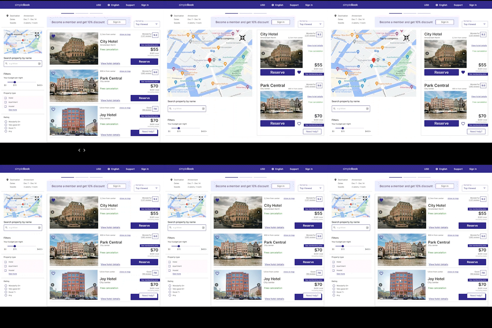
In parallel with usability testing, I created the final screens in Figma. I went back to the first iterations and compared the final results with the research data to determine whether I covered the goals.
Annotations for developers
Another step was creating annotations for developers and other stakeholders.


