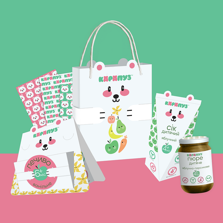
Food company "Карапуз" Redesign and Packaging

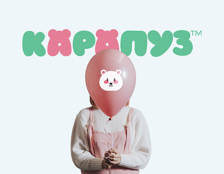

The logo is formed from convex round letters that look like balloons. The actual logo is the word "КАРАПУЗ". The letters "A" encode a bear (its ears are depicted) - the main character of the corporate style, which appears on the packaging. For emphasis, these letters differ from the entire inscription in color.