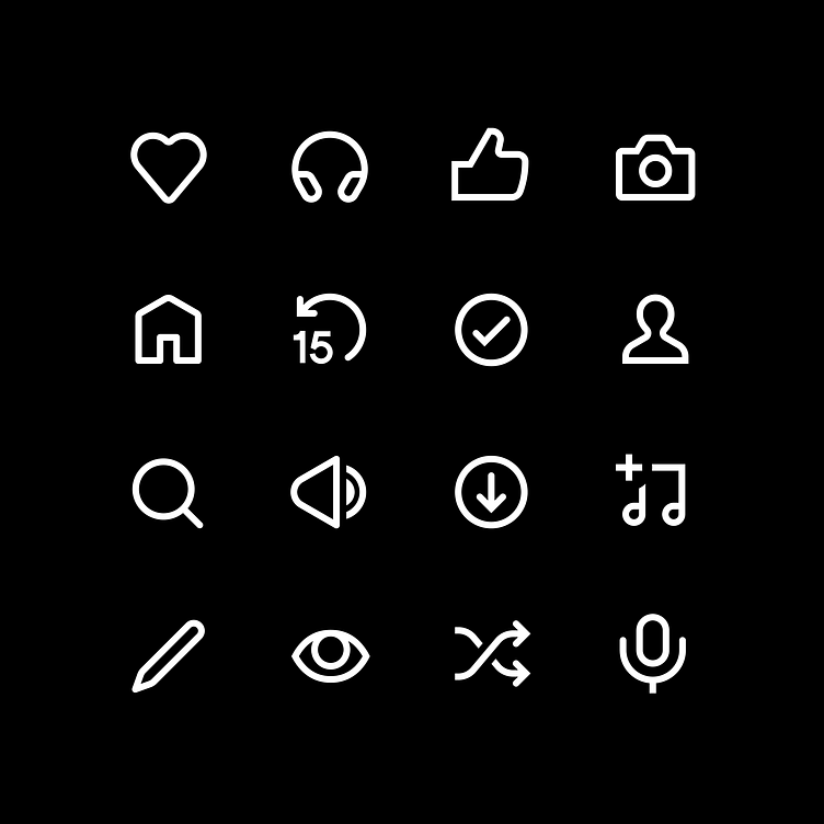
Spotify UI Icons
I remain so proud of the icons I designed for Spotify. Working closely with the incredibly talented team at Spotify Design this evolution was a celebration of progressive digital design. Not only did we reduce the digital footprint of the set by 60%, we also reduced the visual complexity of the shapes and upped the readability too.
You can read more about the project here:
https://spotify.design/article/refreshing-our-icon-system-the-why-and-how-behind-the-changes
More by Rob Bartlett View profile
Like
