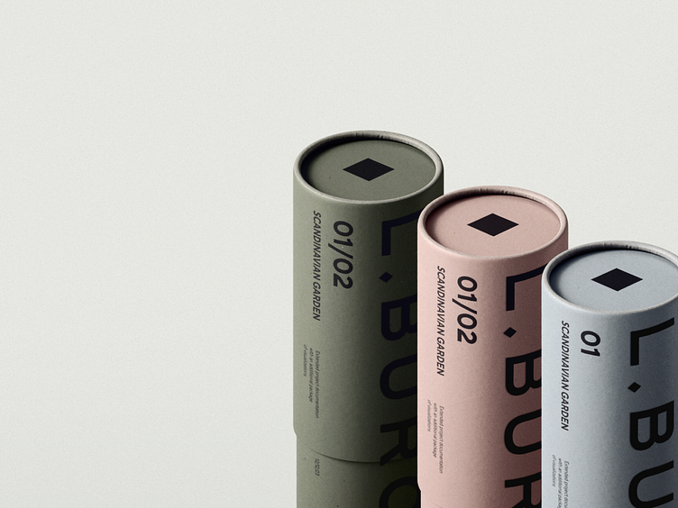
Branding for the landscape bureau of gardens
We refreshed the logo, worked out brand constants and adapted the design to different media.
Idea
The idea is revealed in the logo. The dot transformed into a rhombus symbolizing both balance and mobility.
The color palette reflected the main characteristics of the Scandinavian garden.
The sketch lines on the media have become a reflection of the dynamics of the brand and the materials used in the work.
More by Nimax View profile
Like


