Rebranding & Website - Klavierunterricht-Freiburg.net
Design System
Creating a Color Scheme
Based on her previous website and logo, i decided to create a monochromatic color scheme with some accent colors.
I created Neutrals with a hint of the primary color and found accent colors i liked using coolers.co.

Typographic System
Since the target group is parents of young children, I wanted to test combinations of Serif fonts for Headings with Sans Serif fonts for Body Type.
Serif Headings give a more traditional feel to them, because it evokes traditional values from established businesses.
That suits this project well because the client has a good reputation in the area for being a master pianist and highly educated teacher.
I've chosen different fonts for each the Serif Headings and Sans Serif Bodies to explore.
Typographic Exploration
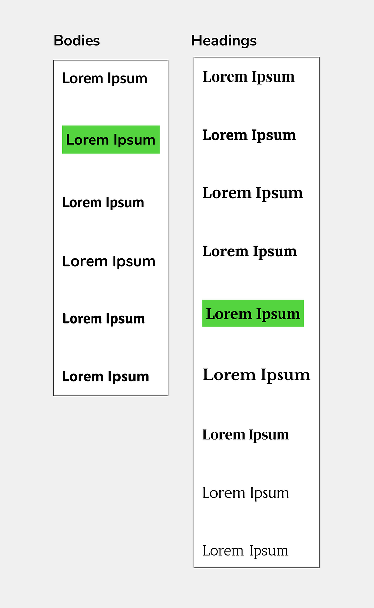
In the end, I've chosen to go with PT Serif for the Headings and Nunito Sans for Body. Nunito Sans had a good variety of weights, which wasn't absolutely necessary for this project, but good to have since we needed to play around with different contrasting font size points later in some sections such as the Hero Section.
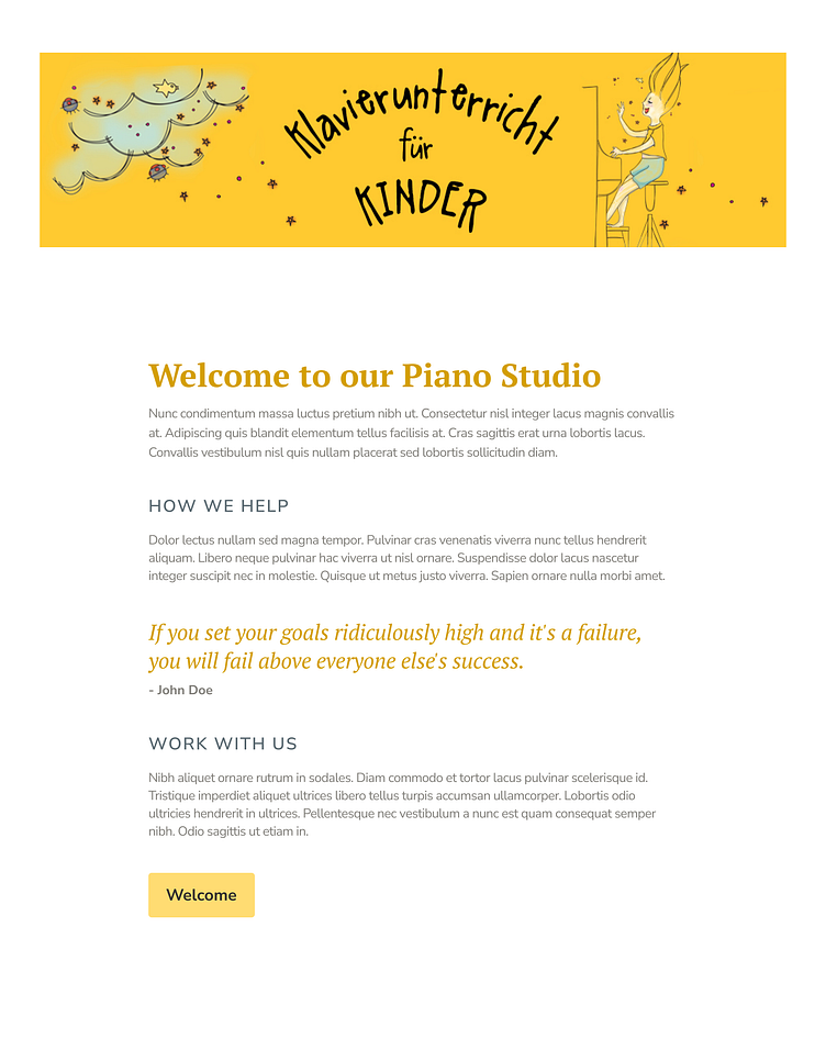
Typographic Branding
Now that I had the Fonts, I needed to create different text styles that were actually usable and in-line with the brand feel.
First I've played around with different primary colors shades for the headings, where I found that the heaviest color would look best on a white background because for accessibility it had to have a high degree of legibility.
For the body type I played around with some of the different Neutral colors until I found some good combinations with the Headings.
Next, I looked at how line spacing and line height would make a difference in making it more interesting.
To round off the brand example, I made a primary button and played around with fill colors and text colors to find a nice match using
Typographic System
With the exploration complete I translated it into a Typographic System for using it later with styles & classes in Figma and the Web Development process.

Style System
Out of the color and type exploration I created figma classes and styles to help myself and team members while designing and keeping everything neat and tidy.
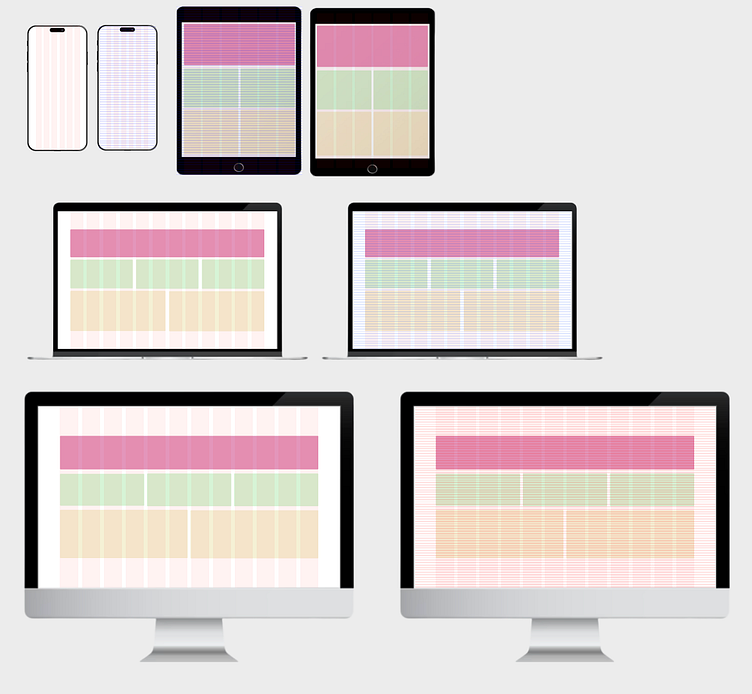
The grid styles are pre-made layouts I use when designing for different Break Points.
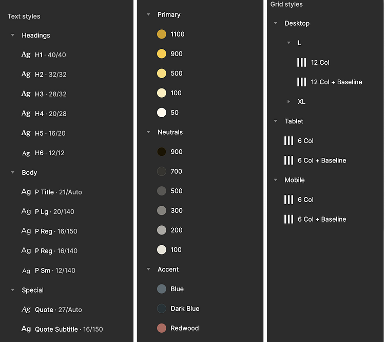
Grid Styles
Visual Assets
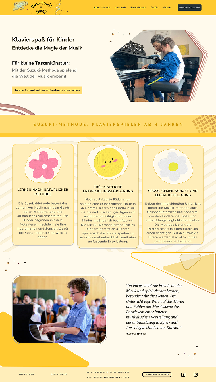
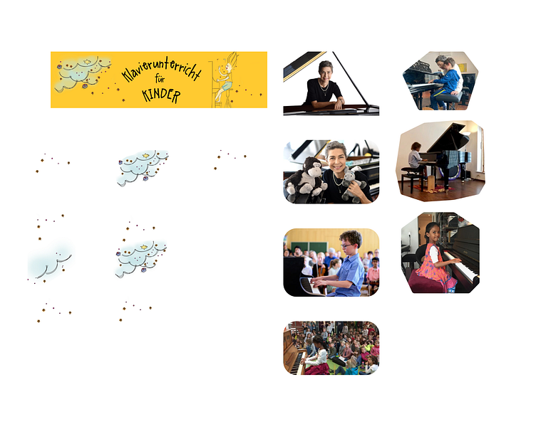
The logo was already provided as well as images and illustrations.
Based on that I used masking to create some different image designs for the photos.
High Fidelity Design
Based on my design exploration I started creating a design for the home page using layout grids.

