Personal Website

Motivation
A personal website should give a visitor a good sense of who one is and what one's. Many other software engineers have perfectly functional and aesthetically appropriate websites, but most of the personal websites I saw focused on one specific aspect of themselves. For my peers who were studying computer science, this meant websites dedicated to their projects. Occasionally, I would see my friends with websites that had some hobbies, but these were always a small part of their website.
For me, this wasn't enough.
My approach to building and creating was interdisciplinary, and I wanted to establish an online presence that showed off the diversity of activities I did while avoiding being surface-level. I did not wish to just build a portfolio website; I wanted to build a truly personal website that was both functional and representative of my personality and approach to solving problems.
Design
My first attempt at designing my website took the idea of boldness and turned it up to 11. Because of its tendency to stand out, I was inspired by neubrutalism and and chose that style as the basis for my personal website.
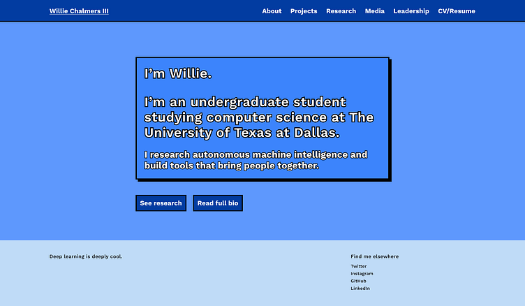
Although I felt satisfied by creating my own personal brand and applying it to the web, I had to reconcile that desire with a need to demonstrate a sense of professionalism to potential employers. The landing page felt busy, and I started to want something that screamed my personality but in a more subtle way.
I produced another iteration of the website landing. However, instead of treating the landing page solely as another page on the website, I decided to treat it as a hub for the different worlds I occupied - software projects, design, and AI research.
And of course, I gave it an automatic dark theme.

This second iteration felt very right to me. The boldest elements on the page - both figuratively and literally - were my work, and if someone wanted to get in touch with me, the options were very accessible. Furthermore, I preserved the boldness of the neubrutalist aesthetic - the vibrant colors and bold outlines - without being too overpowering. The block-based motif would become a common element throughout the rest of my website.
